macOS
Hue Sync
A macOS app for Philips Hue. Rooms, zones, scenes and automations in one window, plus a mode that samples what is on the display and streams those colors to the lights in the room. Talks straight to the bridge on the local network, with no account and no cloud in the middle.
Overview
One window for the lights in the house
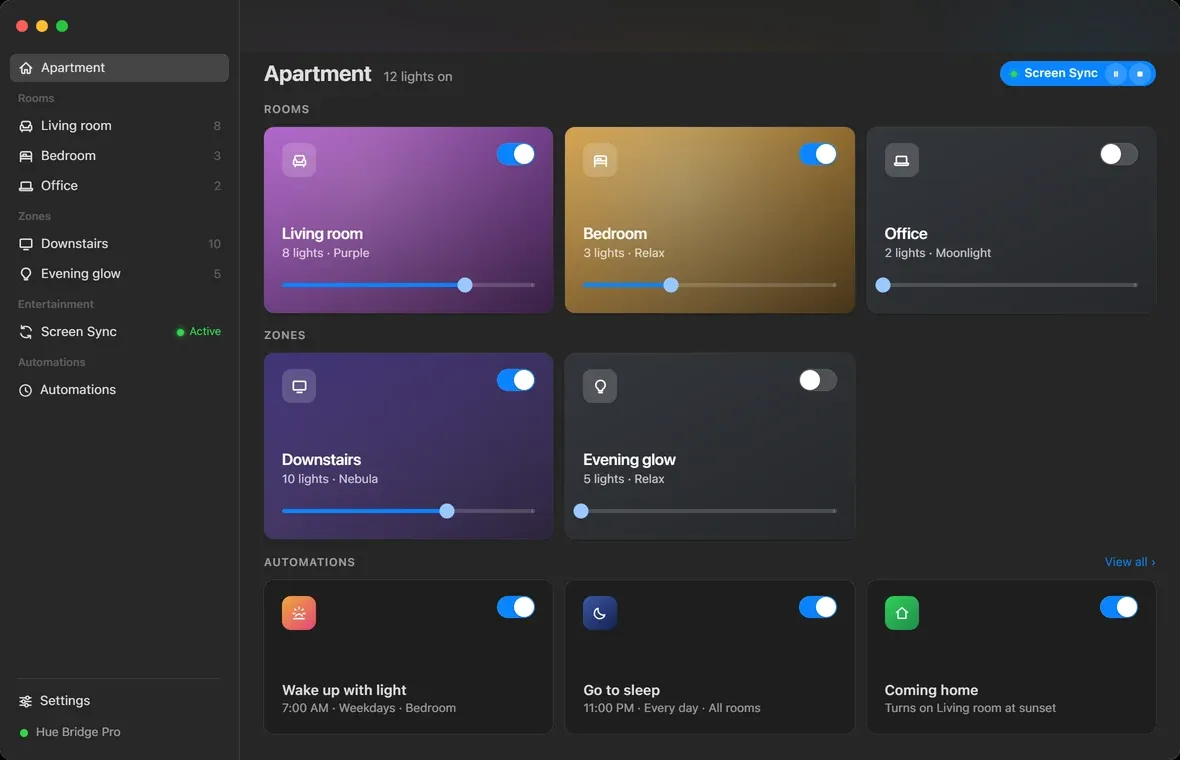
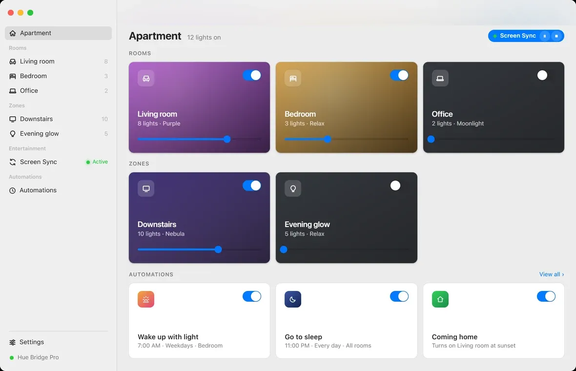
Hue Sync is a Philips Hue app for the Mac. Rooms and zones down the left, everything you can do to them on the right, and a mode that turns the lights into an extension of whatever is on the screen.
Philips already ships a desktop app. It does one of those things, and the design work here started with a fairly specific frustration about which one.
Starting point
A sync utility, not an app
The official desktop app is Hue Sync, and it syncs. That is the entire scope. Rooms, scenes, schedules and everything else live in the phone app, so the machine with the large screen and the keyboard is the one device that cannot control the lights.
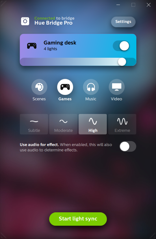
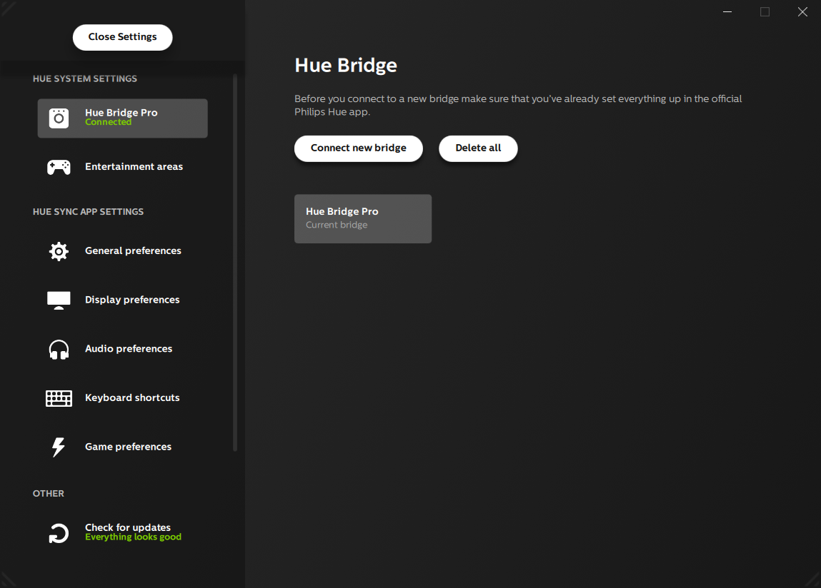
It only does sync
No rooms, no zones, no scene picker, no automations. To turn one lamp down you put the desktop app away and pick up your phone, which is a strange thing for the desktop app to ask.
A panel pretending to be a window
It is a fixed narrow portrait shape that does not resize, on artwork that fights the controls sitting on it. There is a lot of empty space under the buttons and no way to use it for anything.
It does not look like macOS
Custom buttons, custom toggles, its own idea of a settings window, and a green primary action that is not the system accent. Set it beside any Apple app and it reads as a port.
The bridge itself is not the limitation. Philips publishes the API, the bridge sits on the local network, and everything the phone app does is reachable from a Mac. The desktop app just never went after it.
The model
Sync is one thing the app does, not the whole app
So the structure inverts. The sidebar is the house: rooms, then zones, then Screen Sync, then automations. Sync is an item in that list rather than the thing the list is attached to.
The dashboard is the first thing you see and it is meant to be readable from across the room. Each room card takes the color the room is currently set to, so the window is a map of the house rather than a list of names. Underneath the name is the count of lights and the scene that is running, and a brightness slider sits on the card itself, because turning a room down is the single most common thing anyone does here and it should not need a click first.
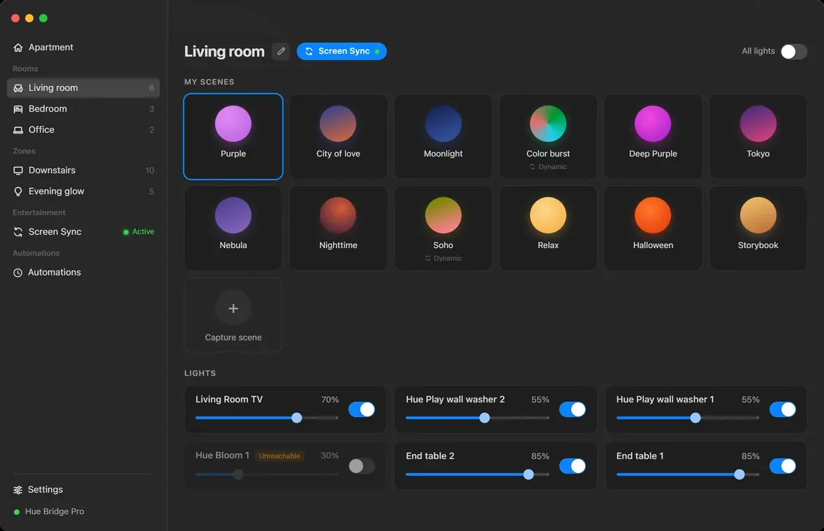
Opening a room gives you its scenes as colored orbs, with the running one outlined, and the lights themselves underneath as individual rows. Dynamic scenes, the ones that cycle rather than hold, are labeled as dynamic rather than looking identical to the static ones. Capture scene is the last tile in the grid: set the room by hand, then save what you arrived at, which is how people actually end up with a scene they like.
Screen Sync
The feature the other app is built around
Screen Sync samples the display and streams representative colors to a Hue entertainment area, so the lights behind the monitor track what is on it. This is the one thing the official app does, and the design here is mostly about making it a normal part of a larger app rather than the reason the app exists.
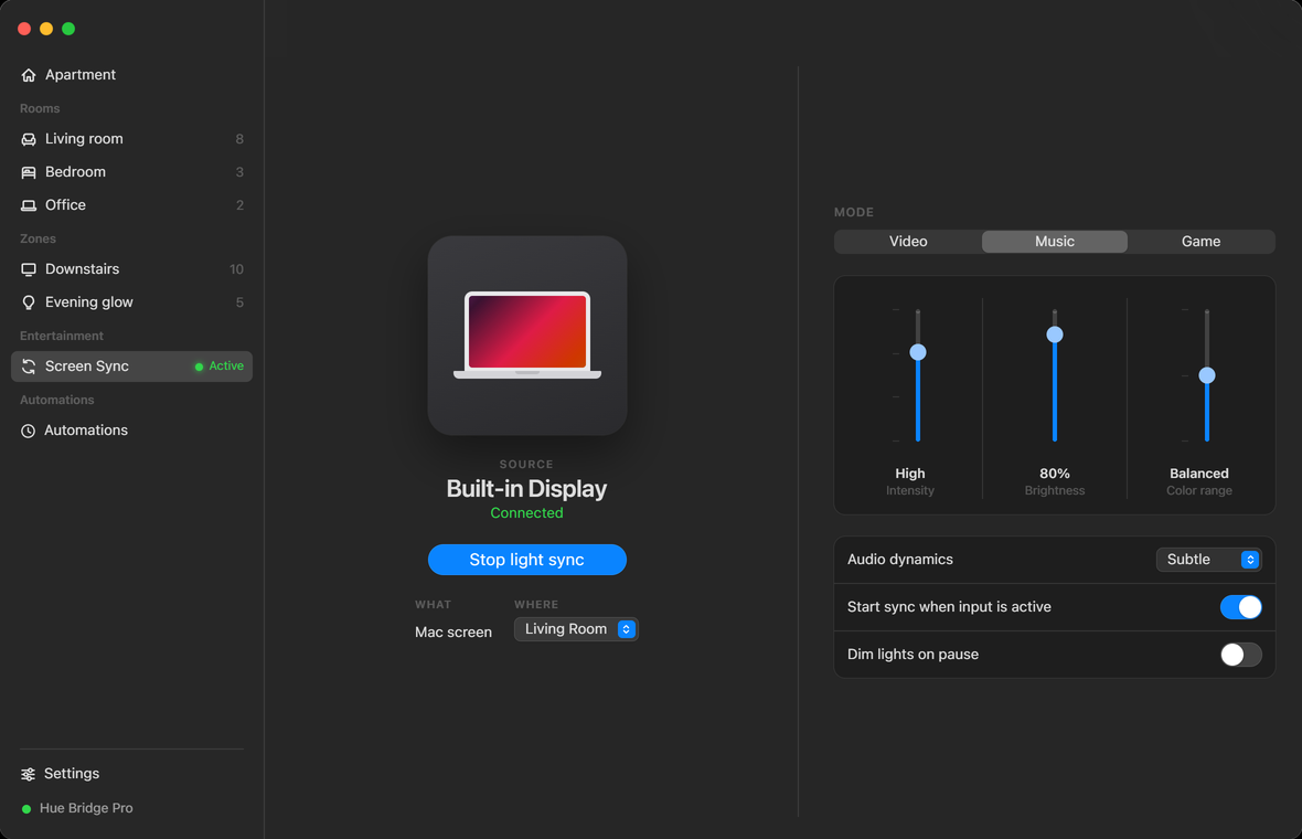
The screen answers two questions and stops. What it is watching, on the left, with the source display named and its connection state under it, which matters the moment there is more than one monitor. How it should behave, on the right, as three sliders: intensity, brightness, and how far the color is allowed to travel from what is actually on screen.
Everything else is a toggle in a list underneath. Start when input is active, dim on pause, audio dynamics. They are worth having and they are not worth a control each on the main surface.
Automations
Six routines, grouped by what triggers them
The other half of what the phone app can do and the desktop app cannot. Six types, and the design decision was how to group them.
Daily routines
Daily routines
Timers and schedules
Timers and schedules
Location
Location
Grouping them by what sets them off rather than listing six in a row is the whole of it. Daily routines happen because of the hour, timers and schedules because you asked for a span, and the location pair because of where your phone is. Those are three different kinds of trust to give an app, and they read better separated than mixed.
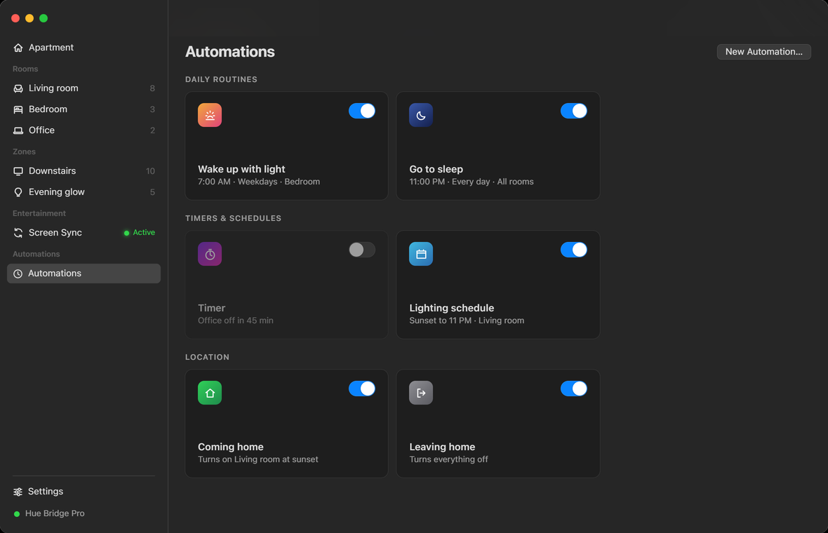
Every card says what it will actually do, in the words you would use out loud. Seven in the morning, weekdays, bedroom. Turns everything off. An automation you cannot read at a glance is one you end up deleting rather than editing.
The prototype
Try it
It runs. Open a room and pick a scene, take a brightness slider somewhere, or go into Screen Sync and change the mode. The lights it is controlling are imaginary. Everything else on screen behaves.
This one is interactive. It needs more room than this screen gives it, so it opens on its own.
Open the prototypeWhere it stands
Designed, written, waiting on hardware
The design is finished and the interface above is the prototype it was finished in. The SwiftUI app is written against that prototype and has not been compiled or pointed at a real bridge yet.
As with the other builds here, the screens on this page are an HTML prototype drawing macOS controls. They are accurate about layout, behavior and every state the app can be in, including the empty ones. They are not photographs of a running app.
Two things are genuinely unproven and it would be dishonest to present them otherwise. The normal control surface talks to the bridge over its documented HTTP API, which is well-trodden ground. Screen Sync does not: it streams over a separate, low-latency channel that has to negotiate an encrypted UDP handshake first, and whether that negotiation works the way the documentation implies is a question only a real bridge can answer. The automation types are the same shape of unknown, written against published schemas that firmware is free to disagree with.
Neither of those is an interface problem, which is the part I was actually here to solve. But an app that cannot connect is not an app, so that is what comes next.