macOS
MacFTP
A dual-pane FTP and SFTP client for macOS. Local folders on the left, the server on the right, and a transfer queue you can put wherever you want it. Designed because the client everyone uses is a Windows app wearing a Mac icon.
Overview
A file transfer client that belongs on the machine
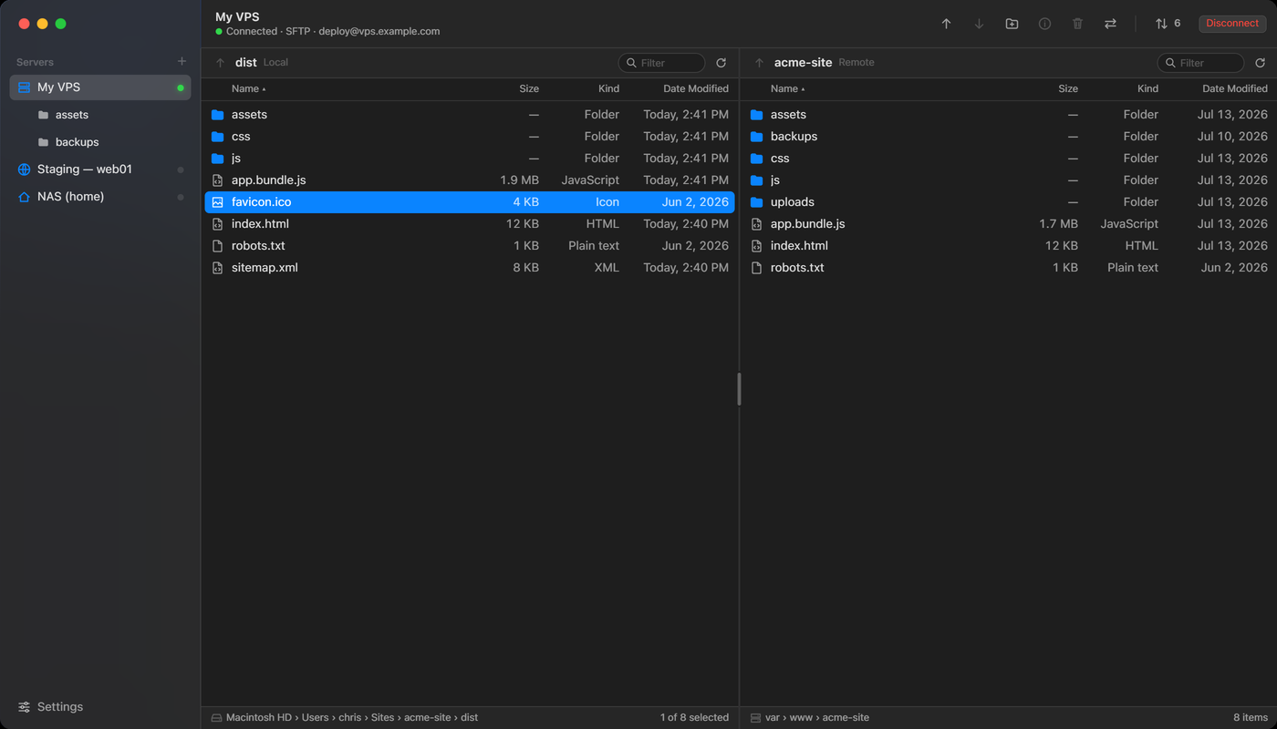
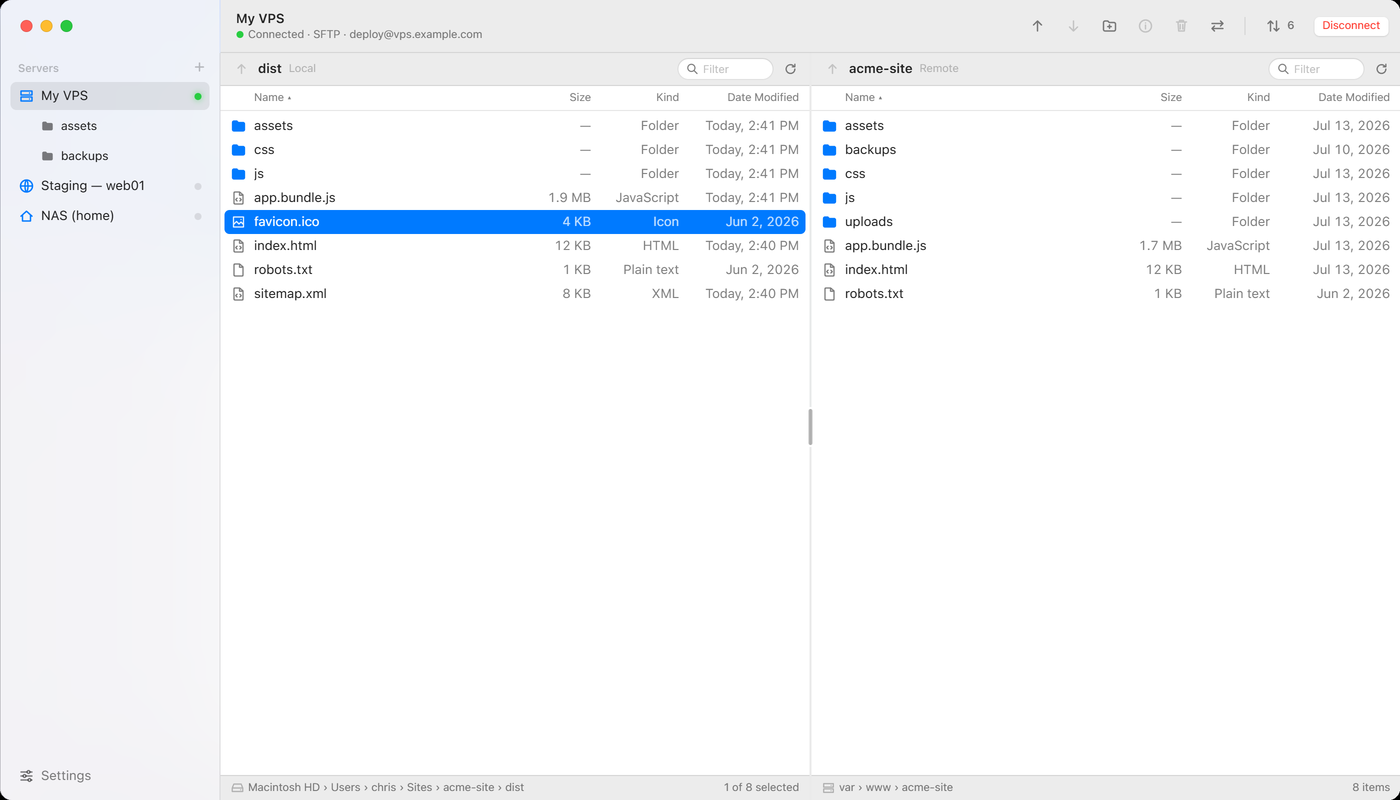
MacFTP is an FTP and SFTP client for macOS. Your Mac is on the left, the server is on the right, and moving a file between them is a double click. Everything else on screen exists to tell you what is happening to that file.
It is being built because I use FileZilla and I do not enjoy it. That is the whole reason. The design work was in turning a complaint into something more specific than a complaint.
Starting point
The client everyone uses, and what it costs
FileZilla is the default answer, and it earned that. It is free, it is on every platform, it has been maintained for two decades, and it does everything. None of that is in question. What I wanted to change is how it feels to sit in front of.
No dark theme
This is the one that started it. Every other window I have open follows the system appearance, and this one stays white. At night it is the brightest thing on the display, and there is no setting for it.
Four panes, three of them read
A message log across the top, local and remote in the middle, a queue underneath. The log is server chatter scrolling past, and after twenty years of using the app I have never once needed it on screen while working.
It is not a Mac app
The tables, the toolbar, the dialogs and the settings window are drawn by a cross-platform toolkit. They work. They just do not behave the way the rest of the system behaves, and the difference is loud when it sits beside Finder.
So the brief is narrow. Same job, same protocols, fewer panes, and built out of the controls macOS already ships. Nothing here is a feature FileZilla lacks.
The panes
Three panes, and one of them is optional
Cutting the message log was the first decision and the easiest one. What is left is two file tables and a record of what is moving between them.
The Mac side. Name, size, date modified
The server side. Name, size, permissions
What is moving, what is queued, what failed
Both tables navigate the same way, because there is no reason for the local side and the remote side to have different rules. A breadcrumb across the top of each pane, clickable at every level. An up arrow beside it, dimmed at the root. Double click a folder to enter it, double click a file to move it in whichever direction it is not already in. Command and up arrow goes up in whichever pane has focus.
The columns differ, and only where the two sides genuinely differ. Local shows name, size and date modified, which is what Finder shows. Remote replaces the date with permissions, set in a monospaced face, because on a server that is the column you actually go looking for.
Transfers
Where the queue lives is your decision, not mine
The third pane was the one worth thinking about. A transfer queue is either the most important thing on screen or completely in the way, and which one it is changes several times an hour.
So it is a setting rather than a layout. By default the queue is a floating capsule at the bottom of the window: a direction arrow, a count, a speed, a progress bar and an estimate. Enough to answer "is it still going" without giving up any width. Click it and the full inspector opens.
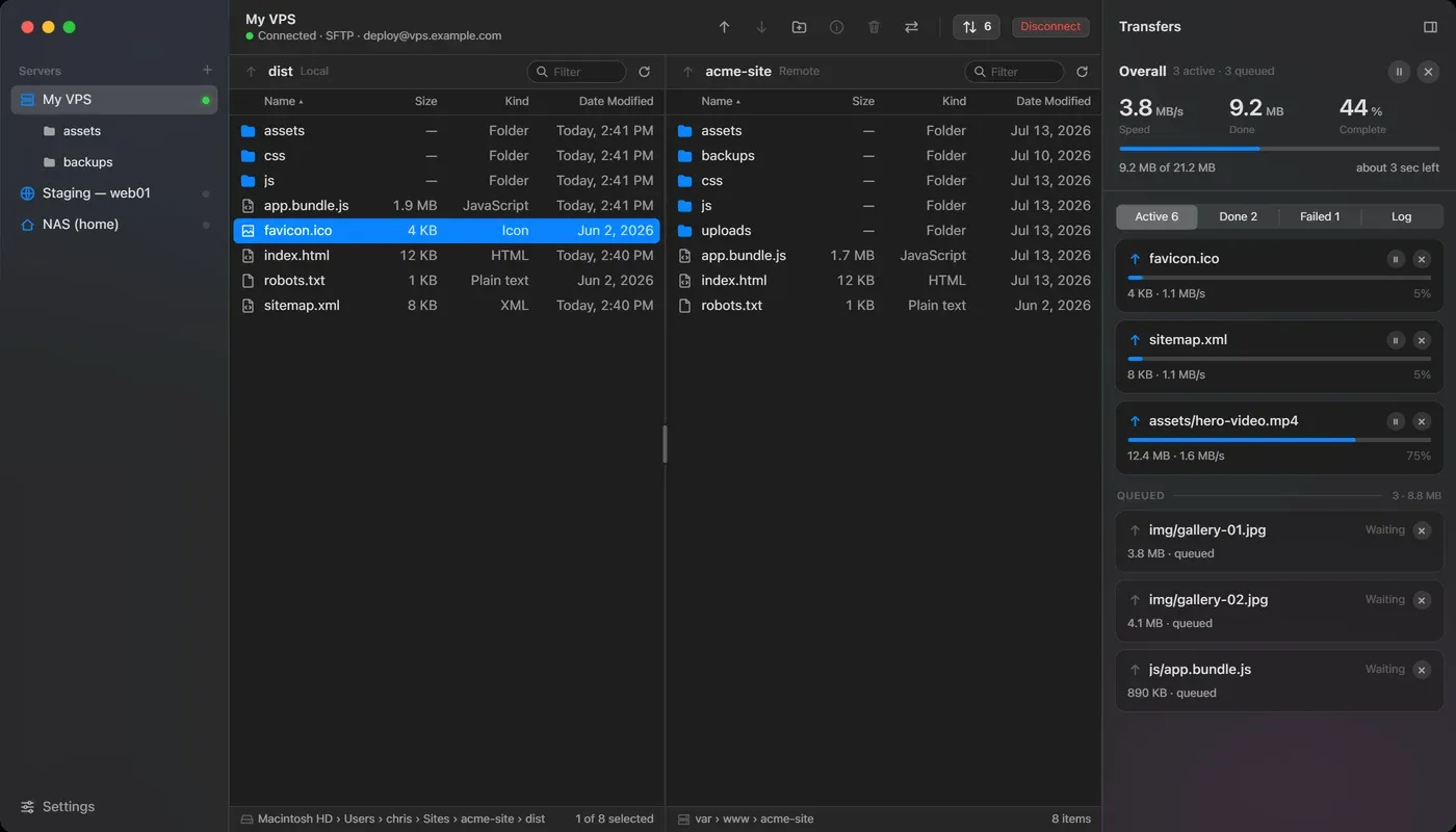
The inspector answers the questions the capsule cannot. Overall throughput at the top, then a card per file with its own bar and its own cancel. Active, Done, Failed and Log are tabs rather than a single scrolling list, because a failure needs to be findable without reading past everything that worked.
That is also where the message log went. It is still there, still complete, on the fourth tab. It stopped being a pane and became a place you can go when something has gone wrong, which is the only time anyone opens it.
Trust
The parts where getting it wrong costs something
A transfer client holds credentials, overwrites files you cannot get back, and connects to machines that might not be the machines you think they are. Most of the remaining design time went there.
Host keys are a sheet, not a warning
The first connection to an unknown host stops and shows the host, the key type and the SHA256 fingerprint, then asks. Trusting it stores it. If that fingerprint ever changes afterwards the sheet comes back in red, saying so plainly, because a changed key is a different question from a new one.
Conflicts are answered once
When a name already exists you get the two files, their sizes and their dates, and six ways to resolve it, including overwrite only if newer and overwrite only if the size differs. Apply to all remaining conflicts is a checkbox on the same sheet, so a batch of forty does not ask forty times.
Passwords are not the app's to keep
Credentials go in the macOS Keychain, keyed by user, host and port. The app stores a reference to them and nothing else, and key passphrases are handled the same way.
Deleting a saved connection is reversible right up until it is not
Edit, duplicate and delete all live in the same right-click menu on the sidebar row. Delete is disabled when only one connection remains, so the app cannot be emptied out by accident into a state with nothing to connect to.
The prototype
Try it
It runs. Double click a folder to walk into it and the breadcrumb will bring you back out, open a different server from the sidebar, or send the transfer queue away and get it again from the capsule.
This one is interactive. It needs more room than this screen gives it, so it opens on its own.
Open the prototypeWhere it stands
Designed, written, not yet running
The design is finished and the interface above is the prototype it was finished in. The SwiftUI app is written against that prototype and has not been compiled yet.
Being clear about that matters. The screens on this page are an HTML prototype drawing macOS controls, not photographs of a running app. They are accurate about layout, behavior and every state the app can be in. They are not evidence that any of it transfers a file.
What is left is mostly protocol work rather than design work. The SFTP layer was written against documentation rather than a compiler and needs a pass to match the real library. Explicit FTPS needs a proper in-place TLS upgrade instead of the reconnect that is standing in for one. The interface is not what I expect to change.