Plex, Inc.
Plex is a free streaming entertainment service with products that can scale from phones, to desktops and televisions. I am currently a part-time contractor that designs, conducts research, finds usability issues, and bugs at Plex.
In-App Messaging
As part of our new design system, my responsibility was to create a new messaging design that complies with our new design system and that can be consistently applied to our different messaging types.
Overview
My role was to create a reusable component that streamlined the look and feel of messages within the notification center. This component aimed to address the following: Ensure that the message type or category is easily identifiable and understood, visualize or call out a piece of content that has been shared by another user to accommodate alerting a user of bulk content uploads/shares, indicating the number of pieces in a single message. Looked to other platforms first to gauge user expectations and industry standards. The different messaging types that needed to be accounted for were: New Content, Live Content, Recommended Content, Features, and Onboarding.
Process
Starting with wireframes, the different messaging types had a consistent type of information such as a header, 3 lines of content, timestamp, icon placement, and message status (read vs. unread). Once the information was in place, it was time to test out the different types by simulating information to help identify potential design issues. This process was repeated several times during the cycle each time receiving feedback to further improve and simplify the messages.
Findings
While creating a consistent messaging type, I ran into an issue when displaying a portrait or square poster. This resulted in one image being larger than the other which pushed the text to the right. The solution was to create a static width, not height.
The placement of the avatar icon was chosen to be placed on top of the artwork for consistency. Several locations were tested and this placement was decided as that is where users are most likely to see it.
Design Decision
In an effort to incentivize our users to change and update their avatars and as users are likely to remember their users' avatars. The team decided to only display the avatar icon, not with the username associated.
Modal Updates
In the process of incorporating our new design system throughout our app. These out-of-date modals lacked responsive layouts and our current design system components. Looked at trying to reuse as many components as possible to reduce the creation of new components.
Overview
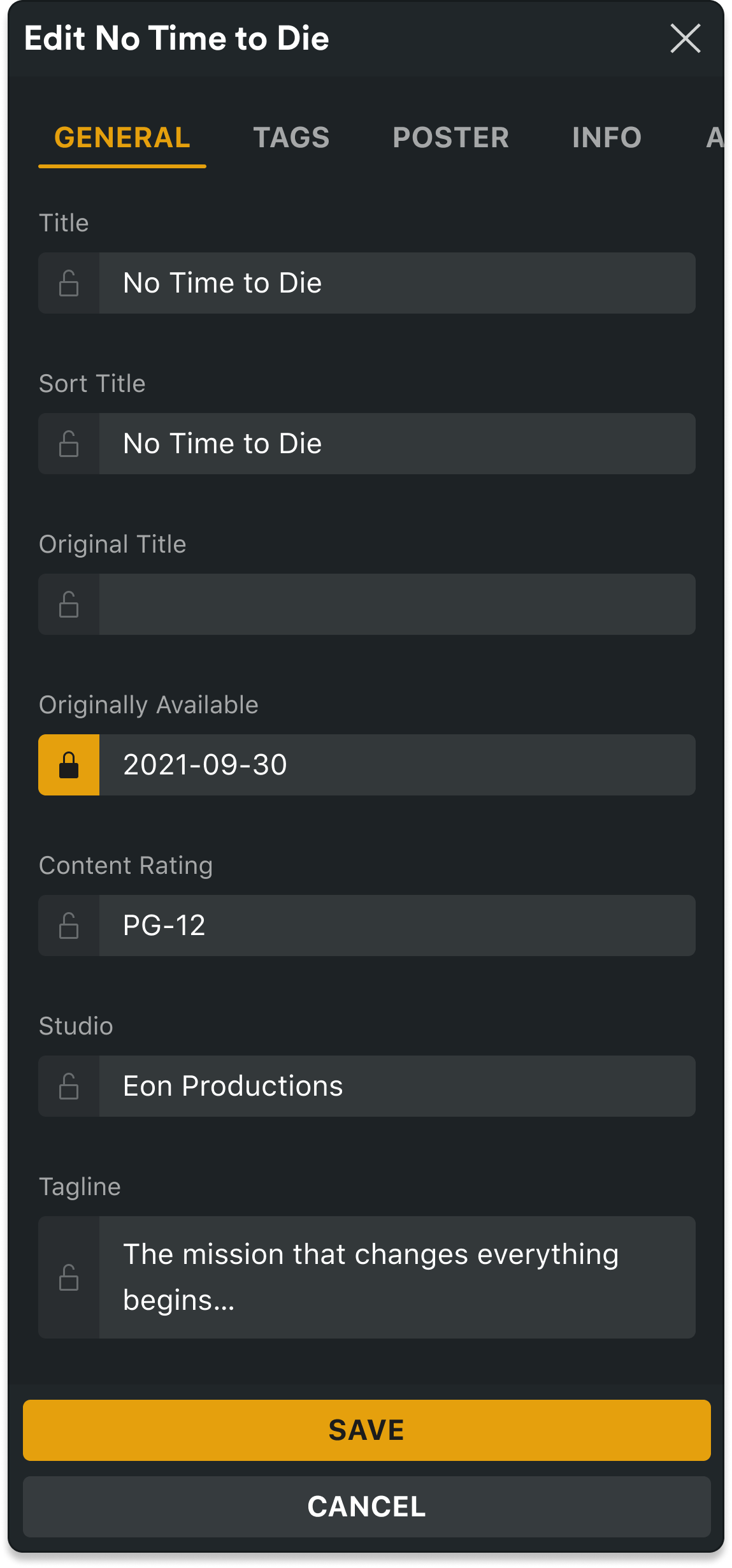
My responsibility was to update the current Modals with our new design system components. There were several design components that weren't specified and needed to be thought out. Our library didn't have a navigation component in a Modal, a lock button within the input field, and a responsive design for smaller displays.
Process
My design process started with documenting the different sections and then looking at what design system components can be easily pulled to convert these over. Then wireframed out the pages that didn't need a lot of work. From there I looked at inspiration for the Info and Advanced sections as they needed new layouts.
General
With the navigation, decided to reuse the navigation that is currently used in our app and decided if it needed to be tweaked this was a good starting point. For the lock on the input fields, drafted up several different locations for the lock and ended up keeping our current design but with an updated lock that changes states. The team decided to remove the rating as its currently shown on the detail page and was unnecessary to have it embedded into an edit Modal.
Left: Current Modal
Right: Updated Modal
Info
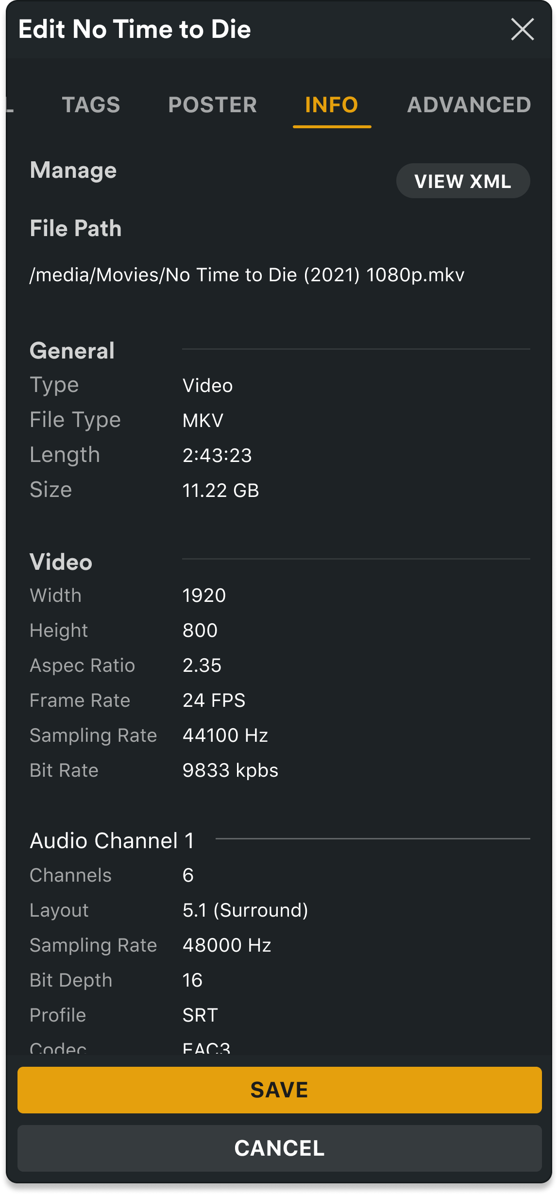
The Info section lacked information architecture. It's presently hard to identify key file properties. Looked for inspiration on how to better organize the information architecture. Several key issues needed to be addressed with the current design; reduce the amount of information, group the type of information into clear sections, add a general section, one column, and reorder. In the updated Modal, a user can quickly identify general information such as video type, file size, and resolution compared to the current.
Left: Current Modal
Right: Updated Modal
Advanced
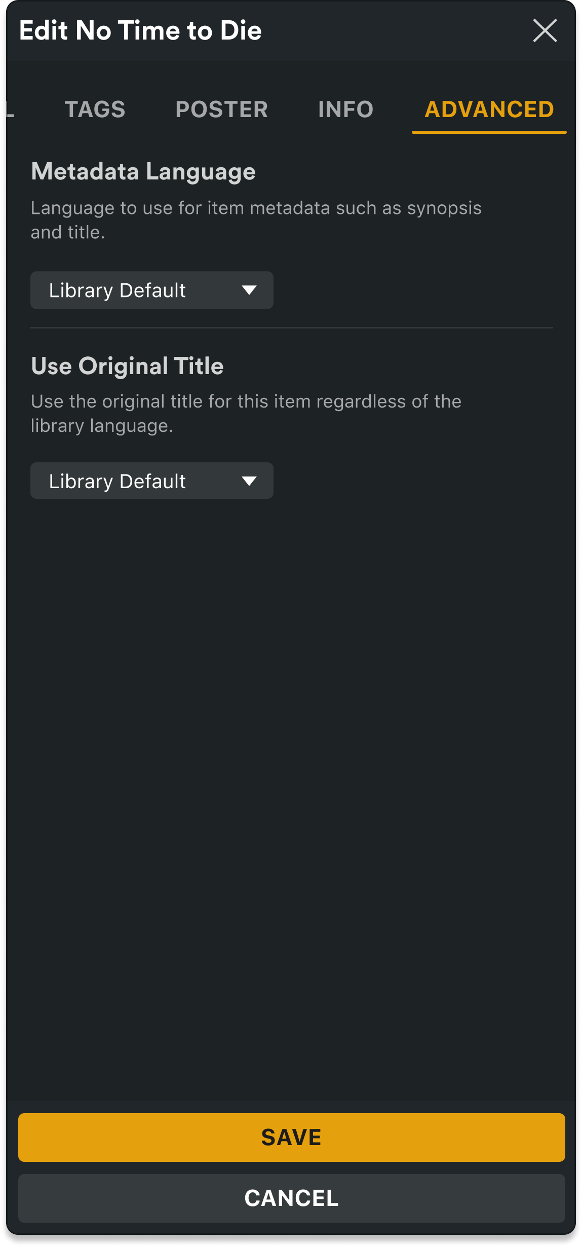
Advanced settings also lacked information architecture, It's presently hard to understand the relationship between the setting and the dropdown as it reads like a sentence, which isn't typical behavior. Looked around for some inspiration and found that settings usually have a header, description, and control. It's also easier to identify and find information when there is some visual hierarchy and consistency in layout. The dropdowns depend on the length of the longest string, placing them all at 160px in width providing a consistent look. Changed the text size and weight on the headers to identify the setting apart from the description. Lastly, added a divider to further visually separate each setting. This updated design will allow the dropdowns to collapse under the description to be responsive for smaller screens.
Left: Current Modal
Right: Updated Modal
New Mobile Modals
The current design currently has no mobile responsive layouts. These show how the layout will change for smaller displays. The navigation will go from a list to a tabbed carousel to save on screen width. The save and cancel buttons will stack and expand the full width. The input fields will expand in height. The advanced settings dropdowns will collapse under the setting description.
Playlist Usability Test
To improve the user experience on the desktop application, discovered the current implementation of adding tracks to playlists was cumbersome and needed improvement. Looked at how other music players handled this and then drafted up two options to test with users.
Plex Player on Desktop
Overview
The motivation for conducting this research was to compare the ease of use, strengths, and weaknesses of different playlist flows. In doing so, determine which playlist flow users prefer overall and identify each user’s preference between a scrollable overflow or modal when adding tracks to a playlist.
Testing
This test was an unmoderated usability test conducted using UserTesting.com which consisted of two Figma prototypes. Users were asked to complete the same task on both prototypes. Follow-up questions determined which option they preferred and why.
Users were asked to complete the same task on both prototypes. Their task was "You're listening to a track from Toto and want to add it to a playlist. Add the track to your Pop playlist." After two follow-up questions were asked, "What are your initial impressions of this action?" and "How difficult or easy was it to complete?"
Below are videos demonstrating each option that the user had to go through to complete each task successfully.
Option 1
Consisted of a scroll-able overflow menu with all the playlists, sorted by recent.
Option 2
Consisted of 10 recent playlists and a View All. The View All launched a modal for the user to see all their playlists.
Findings
Result
Users rated both options and were then asked which option they preferred. Six out of seven participants preferred Option 1 making it the clear winner as they said, "Easy to use, pretty self-explanatory," "Way easier than anticipated it to be," "Really easy to find," "Logical," and "Clear." From personal observation, users seemed to have no issue figuring out how to scroll to see more of their playlists.
Tooltips
The team found that tooltips are vital as users are unable to complete their tasks or test goals without them present. Our initial test run did not include any tooltips or hover interactions on the player icons. This resulted in one participant being unable to complete the tasks and the other almost not completing the tasks. Once added, each participant hovered over the icons for the tooltip. This was needed before discovering that “Add to Playlist” was under the 3-dots (More Actions).
Feedback Modals
Users appreciated the feedback modal that informed them that a duplicate track was added. Consider adding an informational modal when a track has been added or when the track already exists on the playlist.
Plexamp Audit
Plexamp is a premium Plex feature that requires a PlexPass subscription. It is a separate app that allows users to stream their music libraries in a dedicated music app that focuses solely on music.
Overview
The audit that I conducted only involved the player screen while trying to make the least amount of design changes. The following suggestions were to make the app to be better aligned with other music apps and more user-friendly.
Left: Current player interface
Right: Proposed player interface
Right: Proposed player interface
1. Moved Back Button to top left. This helps with users expectancies and recognition. The current location is in an unfamiliar location which users think the down arrow allows them to view the play queue.
2. Added Overflow Menu button at the top right. This removes the hidden feature of taping on the track title to add a track to a playlist.
3. Moved Shuffle and Repeat next to Previous and Next Track buttons. This helps with recognition and identification as these buttons all relate to track playback and are not mixed with other functions.
