Product Strategy
MAP
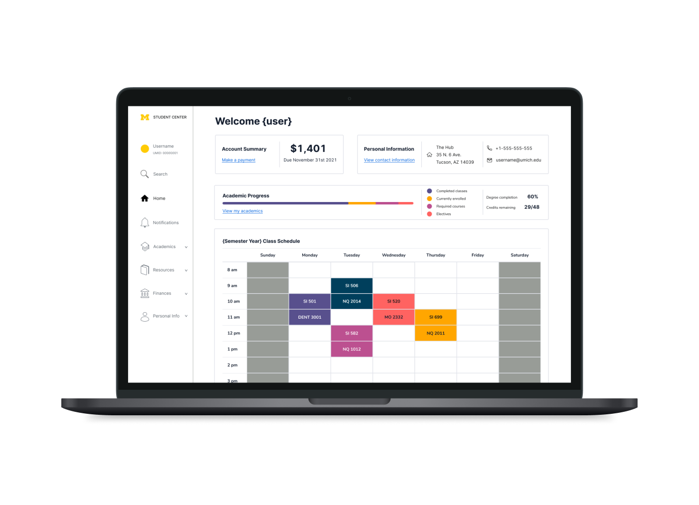
The Michigan Accessibility Plug-in is a browser extension that gives the University of Michigan Student Center a usable, modern interface without touching the system underneath. It is the fastest way to fix a tool 40,000 students are required to use.
Overview
A required tool that hasn't gotten easier in two years
The Student Center is where every University of Michigan student plans and executes their academic life: adding and dropping courses, checking schedules, reading transcripts. The students we spoke to during brainstorming were frustrated with nearly all of it, from registration to basic navigation. The system caters to power users through a dynamic information architecture, and moving between its interfaces is unintuitive.
My role: as a course project, every team member owned every step of the process. I also ran our meeting agendas and led the redesign of the wireframes and the Figma prototype.
"My first impression of the Student Center was confusion… I have been using the system for 2 years, and it hasn't gotten easier."
Participant 2, student interview
Research
Students and ITS told us two different stories
To understand both the pain points and the technical constraints, we ran two sets of interviews, one with students and one with U-M Information and Technology Services, plus a survey, an interaction map with a heuristic evaluation, and a comparative analysis of other universities' systems. Students told us what was broken. ITS told us why it was hard to fix.
Getting in
Signing in and reaching the Student Center from the ERP homepage through Wolverine Access's navigation was itself a hurdle.
Small type, low contrast
Font sizes and foreground-to-background contrast fell short of readable, let alone accessible.
Non-descriptive navigation
Labels didn't help users understand where they were on a page or how it related to the rest.
Outdated aesthetics
The dated look changed how usable students perceived the system to be, before they'd even used it.
One small piece of a big system
The Student Center is a fraction of a large, interconnected ERP. Nothing changes in isolation.
Cloud is coming, slowly
The university is pushing toward cloud services, but building a system from scratch takes serious time and resources.
The decision
Don't rebuild the system. Sit on top of it.
Before settling on a concept we assessed a range of strategies for technical feasibility. A ground-up rebuild would be the best long-term answer, but it isn't the most cost-efficient one, and ITS had made clear how slow it would be. A browser plug-in that restyles and restructures the existing Student Center was the fastest way to ship a minimally viable solution that scales.
Fastest to build
A minimally viable solution that could reach students in weeks, not years.
Accessible by design
Encapsulates accessibility guidelines and improves usability across the whole experience.
No disruption
The ERP stays exactly as it is. Nothing in the underlying system changes.
Proves the case
If it works, it shows the value of a new system and gives ITS usability data to build one with.
Redesign
Four pages into one
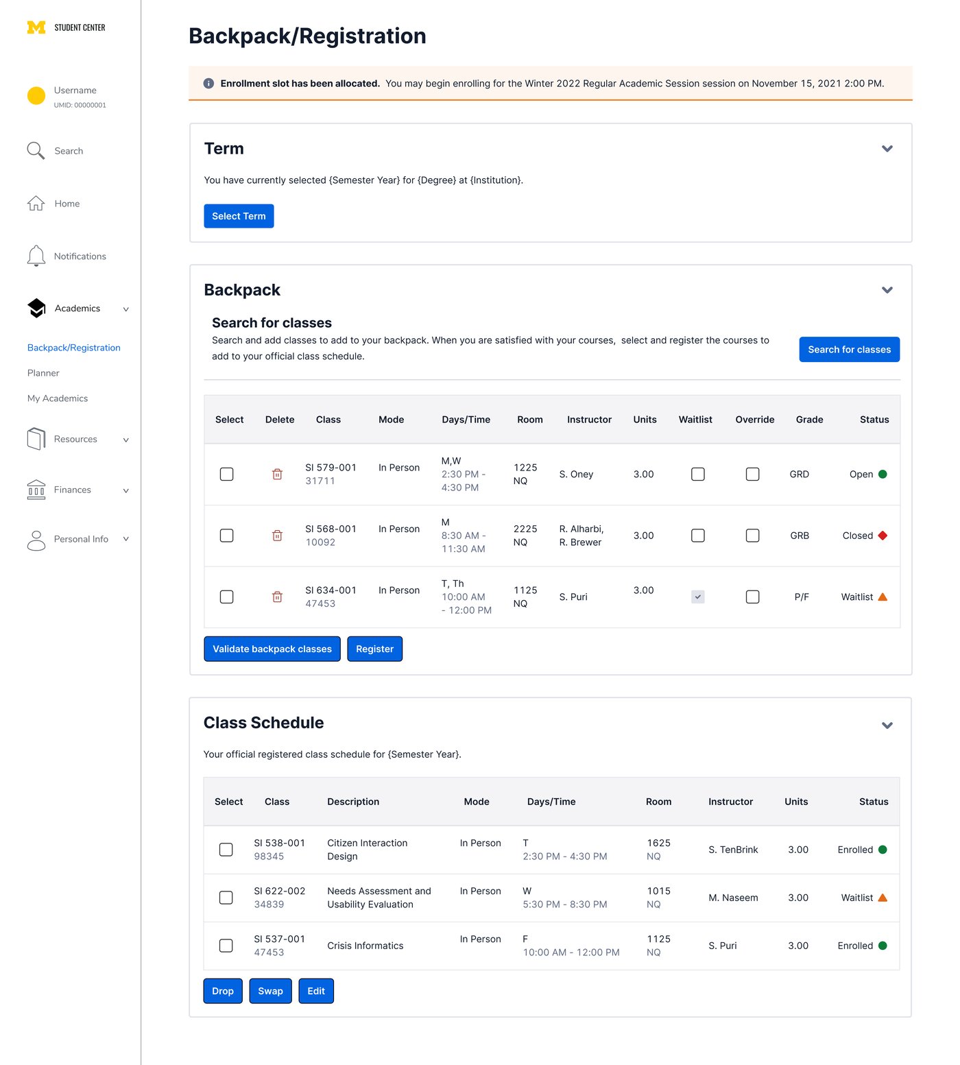
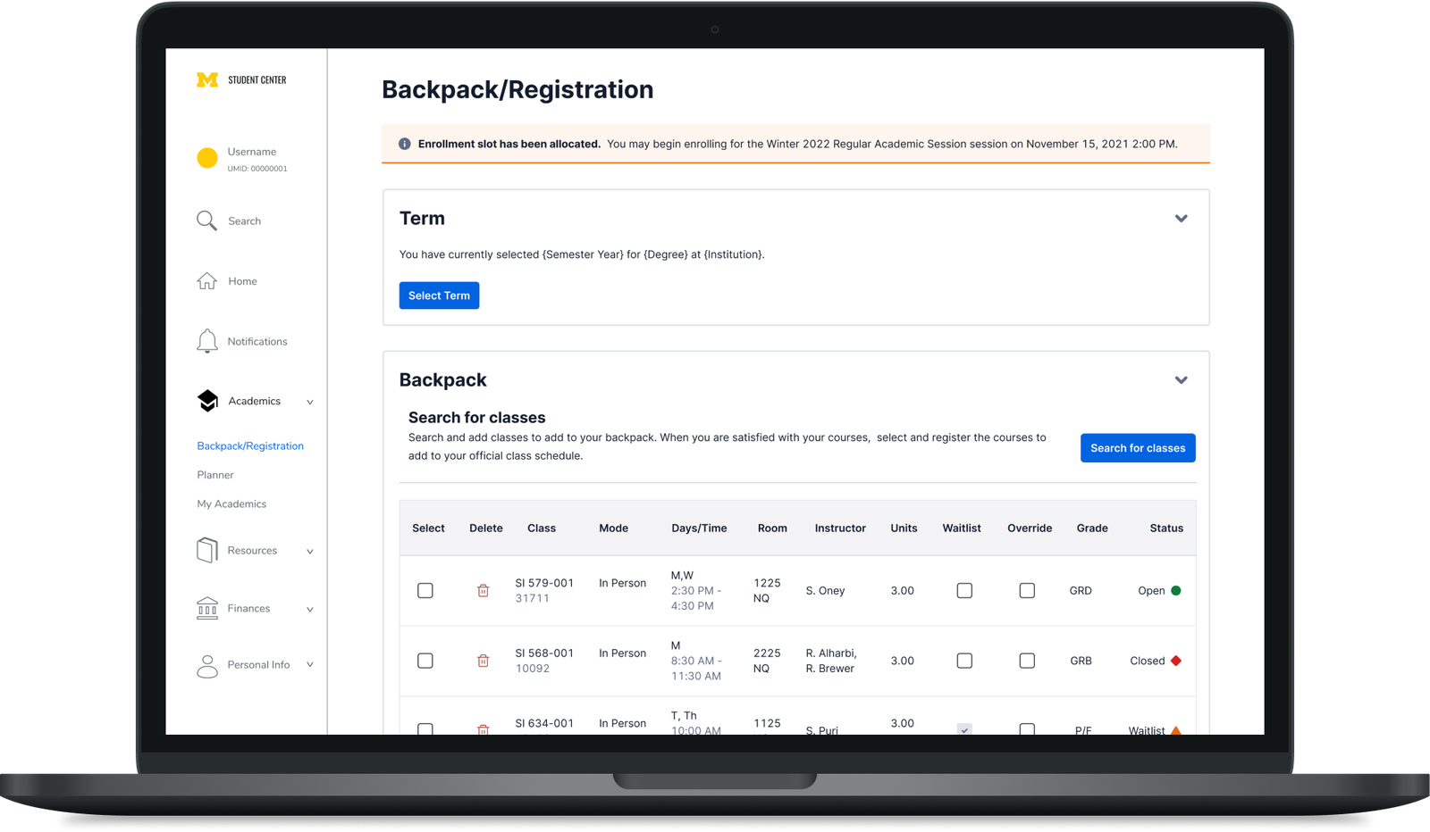
The Student Center has too many pages, and the hardest part of the redesign was cutting steps without cutting function. Modifying a class schedule, for example, put each action on its own tab. We collapsed those four pages into a single Backpack/Registration view: pick a term, search and add classes to your backpack, and see your registered schedule, all without leaving the page.
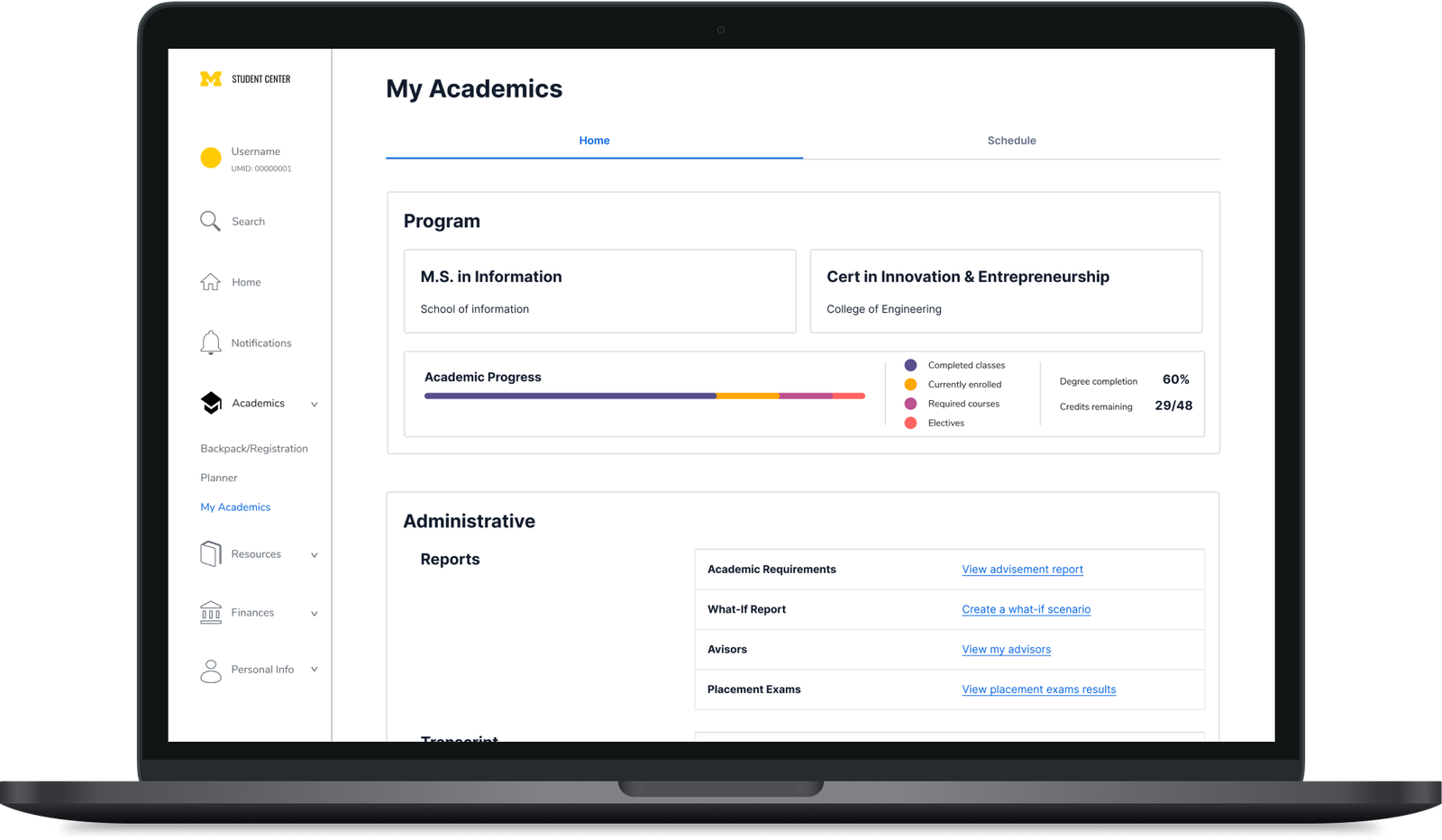
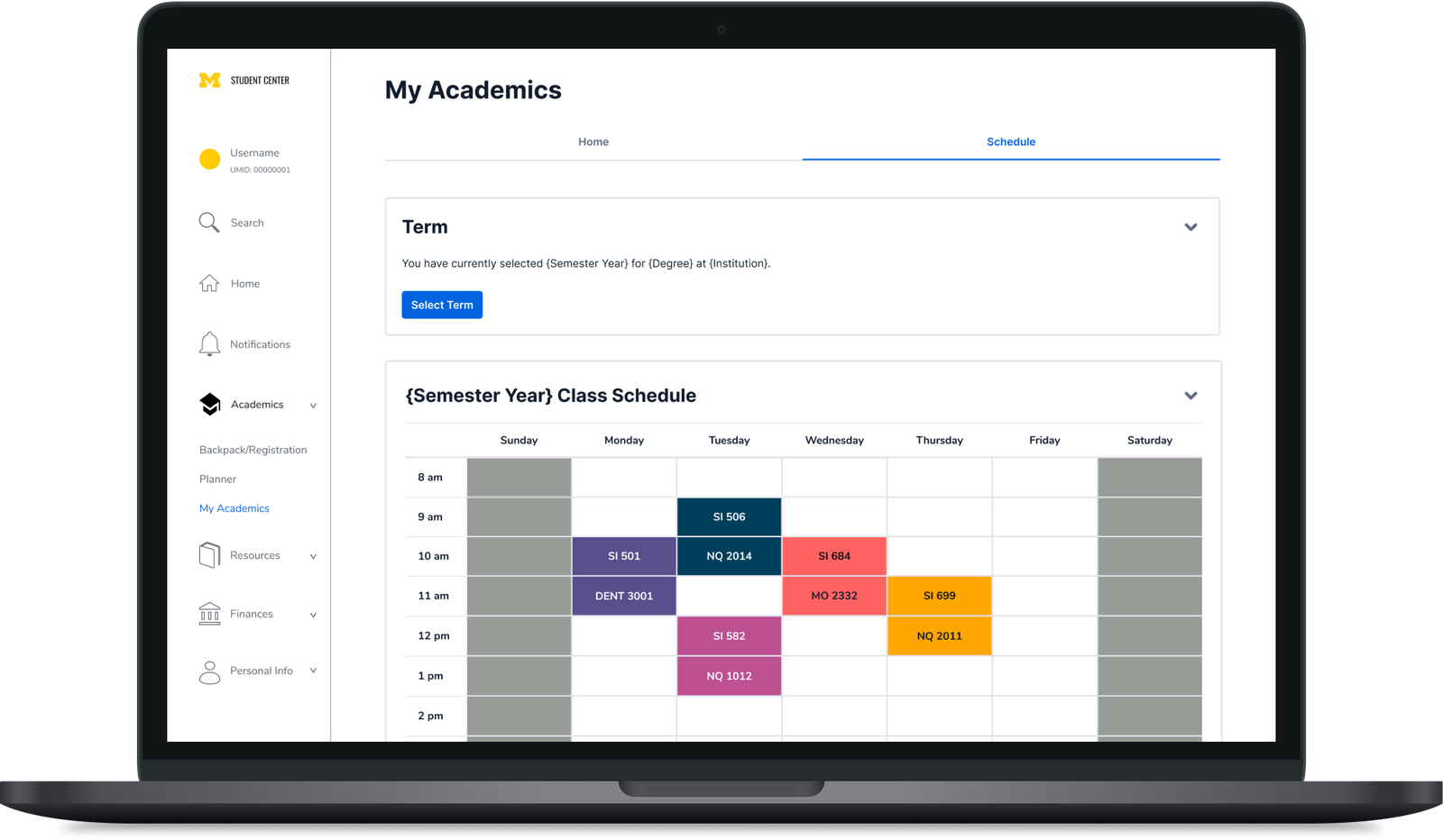
My Academics
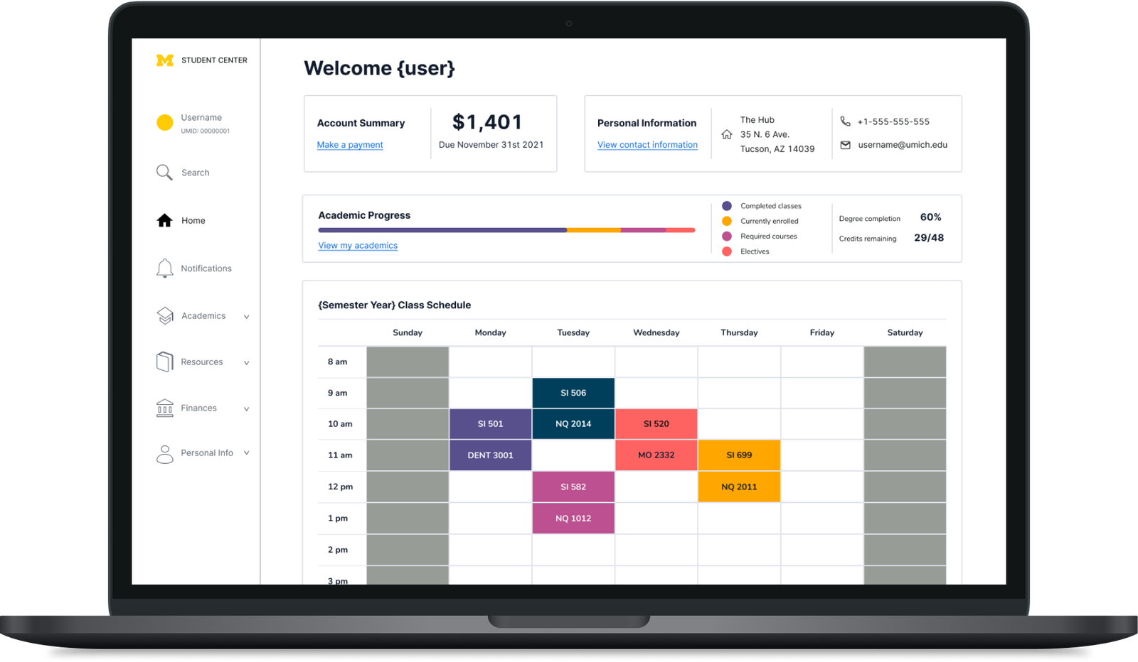
Program, progress, and administrative links on one tab, with the semester schedule and its course list on the next.
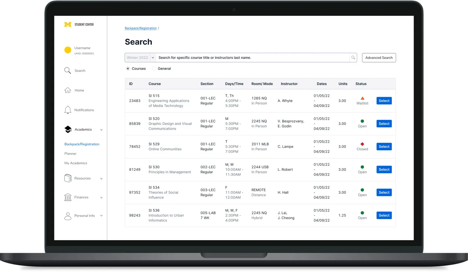
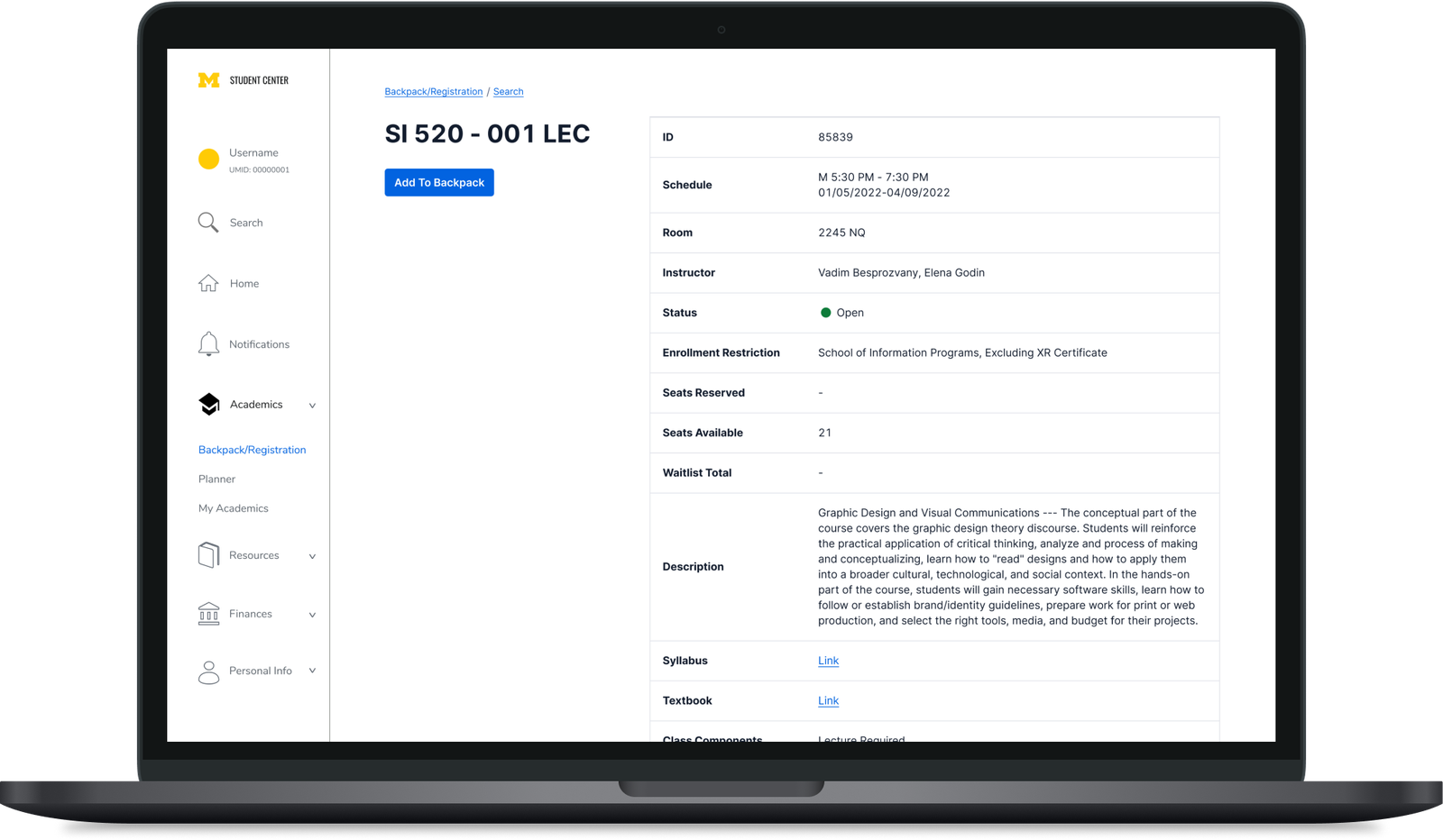
Class search
A single search bar with an advanced option, results in a scannable table with open, waitlist, and closed status, and a class detail page that ends with recommended courses.
Rollout
Registration first, because that's what students said
We planned the release in three phases, ordered by our survey data. Registration is the highest priority for students, so the first six weeks cover Browse, Planner, Backpack/Registration, and My Academics, everything needed to build a schedule. A four-week second phase covers the rest, and a final four weeks adds faculty features.
of surveyed students named course registration the most important part of the Student Center, which set the order of the rollout.
400 downloads to start
Enough of a sample from 40,000 students to survey, interview, and usability-test a version 2.0.
10,000+ over time
Open-source and community-maintained, with the team moderating changes, until the ERP absorbs the improvements.
Limitations
What a plug-in can't fix
The plug-in is quick, cheap, and scalable, and the changes it proves out can be reused when a new system is eventually built. It also has real design flaws we called out rather than hid.
Browser support
Not every browser supports extensions, and an extension uses more resources than a native page.
Bound to the ERP
It can only rearrange features the system already has, and any change to the ERP's source can break it.
Install friction
Some students won't know how to install an extension, which caps how far it can scale on its own.
A bridge, not a destination
The right long-term answer is still a new system. MAP is how you get usable data and momentum for it.
Outcome
A pragmatic answer to an institutional problem
MAP ended the semester as a full Figma prototype covering home, My Academics, class search, and registration, backed by student and stakeholder research and a phased plan to ship it. The lesson that stuck: the best design is sometimes the one that can actually be deployed this year.