Accessibility
Photography portfolio
A nine-page photography portfolio, hand-coded with no framework and still live. Roughly 800 lines of CSS handle three breakpoints and two themes that follow the visitor's system preference. The accessibility decisions underneath needed judgment rather than a checklist.
Overview
A photographer's site, written from scratch
The brief was a multi-page responsive website, designed mobile-first with breakpoints for tablet and desktop. The course supplied very little starter code, so the site was built almost entirely by hand: sketches and wireframes first, then HTML, CSS, and a small amount of JavaScript.
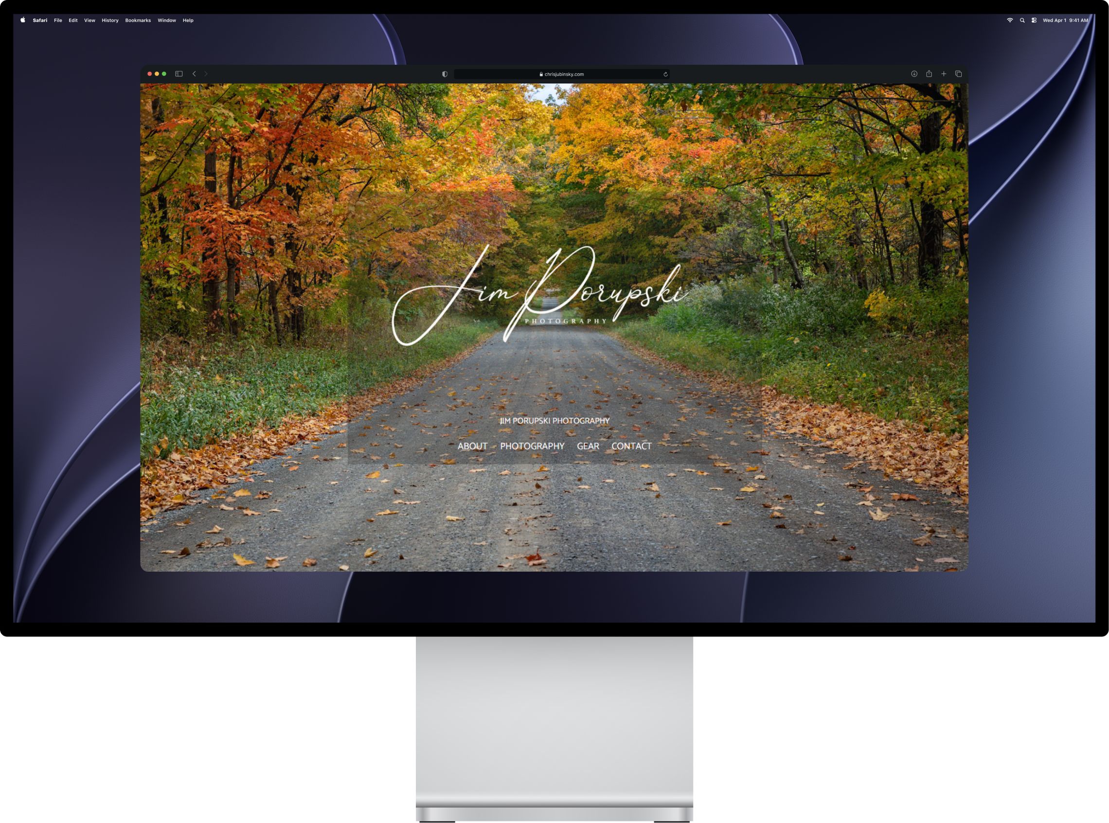
The client: a landscape and wildlife photographer working around Upstate New York. The site puts the photographs first: a full-width carousel on the homepage, a parallax hero on the inner pages, and a photography gallery, gear list, about page, and contact form behind them.
Homepage
A carousel that had to fight the navigation
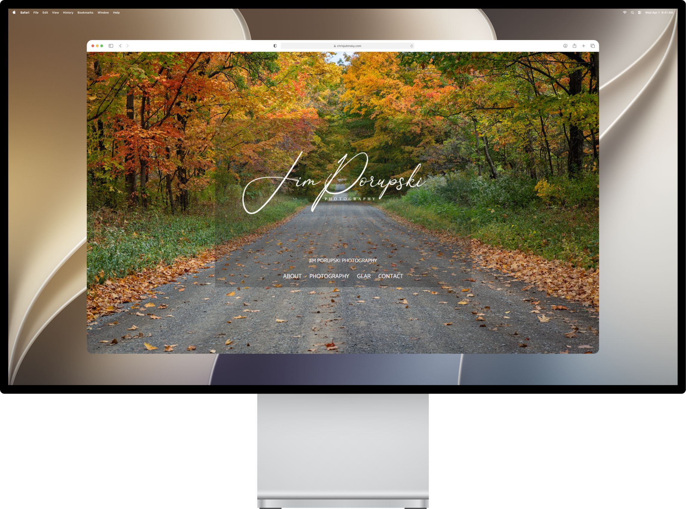
The homepage is one photograph at a time, filling the browser window, cross-fading into the next behind the studio name. A gallery keyframe swaps the background image on a ten-second ease-in-out loop, and the header floats over it on a translucent panel.
Two problems took the longest. Sizing the photograph to the full window meant reaching for 100vh rather than a fixed height. And fading it meant animating opacity, which bled into the navigation sitting on top and faded that too, so the animation had to move onto a different element to leave the header alone.
The cross-fade is browser-dependent
Chrome and Edge interpolate between the two background images and produce the fade. Firefox swaps them without it. The photographs still change everywhere; the transition between them is the part that varies.
Motion has an off switch
Under prefers-reduced-motion, the loop stops on the first photograph. The background image is set explicitly there as well, so the page never lands on an empty frame in a browser that halts the animation differently.
Responsive
Mobile first
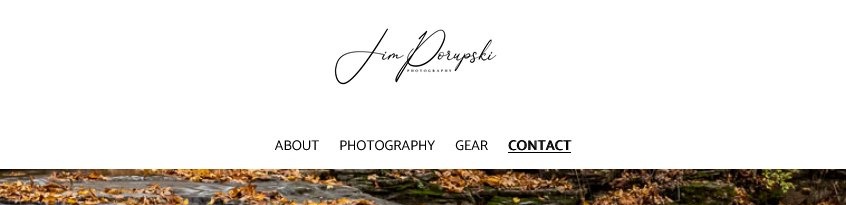
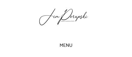
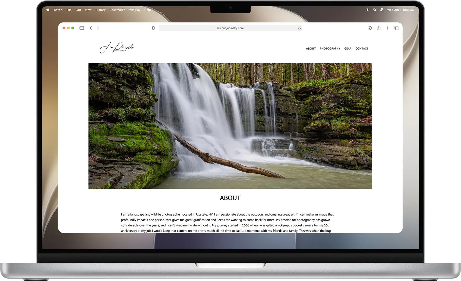
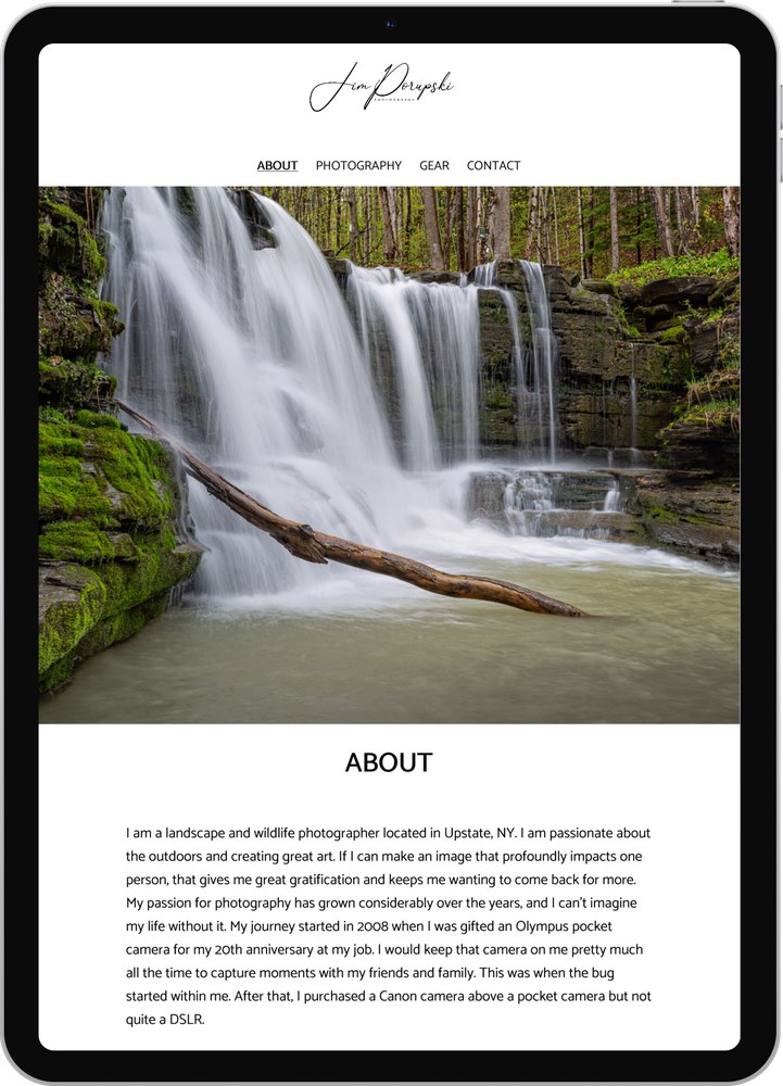
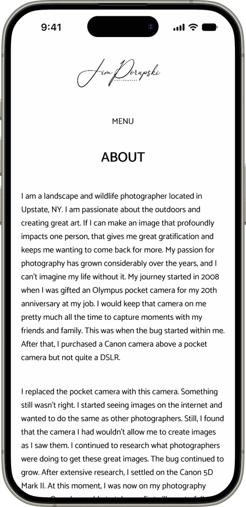
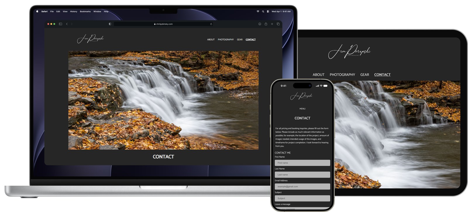
Every page was laid out for a phone first, then widened at 481px for tablet and again for desktop. The header is where the breakpoints show most clearly: a collapsed menu on mobile, a condensed nav on tablet, and the full nav row on desktop. It's shown at all three widths below, to scale, followed by a full page at each size.

The desktop breakpoint moved for a scrollbar
Desktop started at 769px, a value taken from a standard table. At that width the Photography page overflowed and pushed a horizontal scrollbar, so the breakpoint moved to 905px. It ended up set by what the layout needed rather than by the table.
Phones get a lighter page
About, Gear, and Contact drop the parallax hero below the tablet breakpoint. It cuts page weight on the connection least able to afford it, and removes a screen of scrolling before the content starts.
Theming
Two themes, and the asset decisions behind them
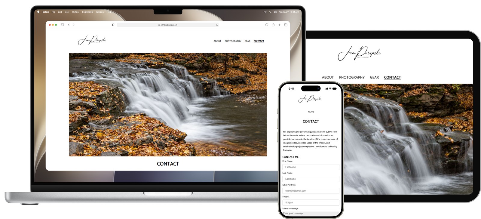
The site has no theme switch. A prefers-color-scheme: dark query reads the preference the visitor already set on their device and restyles the page to match, so the site arrives in the theme they chose rather than asking them to choose again.
Supporting two backgrounds reached further into the build than expected. The signature logo needed a black version and a white one, both written into the HTML, with CSS displaying one and hiding the other. The Gear page photographs all had to be re-exported as transparent PNGs, because a JPEG carries its white background with it and would have sat in a bright box on a dark page.
Validators are fast, not infallible
Axe and WAVE caught real contrast problems and bad tags. But the two-logo swap that makes theming work reads as a duplicate image to a validator, and one flagged it as an error. Knowing which warnings to act on is part of using the tools.
Dark theme is an accessibility feature
It isn't only a preference. A dark page is easier for visitors who are sensitive to bright screens, which is why it follows the system setting instead of hiding behind a control someone has to find.
Details
The decisions you would only find by using it
The site passes Axe, WAVE, and the W3C validator, which is the part that fits in a checklist. The work that took the thinking sits underneath: a handful of small decisions where following the rule literally would have produced a worse result.
Skip to content lands on the heading
The obvious target for a skip link is the <main> element. Here that element opens with the parallax photograph, so skipping to it would drop someone at the top of a decorative image. The anchor points instead at the page's <h1>, a few lines further in, where the content starts.
Reduced motion, undone in two places
One preference, two techniques to undo. The homepage animation stops on its first photograph, and the parallax heroes revert from a fixed background attachment to a normal one, so the image scrolls with the page instead of holding still behind it.
The current page never relies on color
The active nav item is underlined rather than tinted, so it survives for anyone who can't separate the two colors. On mobile the menu collapses after a selection and takes that cue with it, which is the reason every page also names itself in its heading.
Describing a photograph
The hardest writing on a photography site is the alt text. Is "a waterfall in summer" enough, or does the waterfall's name matter? What settled it was describing what the image is doing where it sits, rather than cataloging what's in the frame.
Consistent crops before layout
The gallery images arrived at every size, and grid and flexbox both fought them. Re-exporting the set at a consistent size fixed the layout more cleanly than any amount of CSS aimed at the symptom.
Most sites don't pass
Running the same validators across other sites was the part that stuck. Accessibility failures are the norm rather than the exception, which is what turned this from a course requirement into a habit.
Outcome
A finished site, and a habit that stuck
The site shipped complete and is still live: nine pages, three breakpoints, both themes following the system preference, and every line of HTML and CSS written by hand.
What stuck is smaller than any of that. A skip link that lands on the heading instead of the top of a decorative image. A breakpoint moved off a standard value because the layout said so. Photographs re-exported with transparent backgrounds so a dark page wouldn't frame them in white. None of those are visible in a screenshot, and each one took longer than the problem looked like it deserved.
That's still how I work. Getting it working is the first pass, and the details nobody will ever point to are what separate it from a draft. Accessibility stopped being a checklist here and became part of the same instinct, and I find these the same way every time: by using the thing until something small is wrong.
View the live site