Community
Stylus
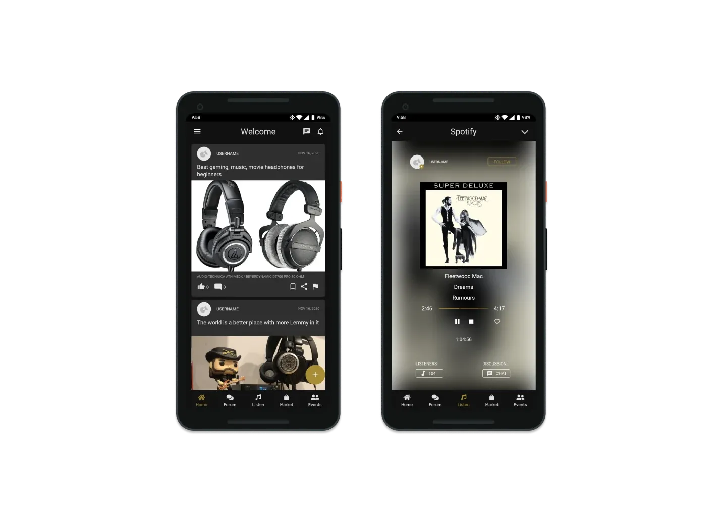
Stylus is an online community where audiophiles come together to discuss, listen, discover, and help each other. One app in place of the scattered, generic forums the community lives on today.
Overview
A community that holds its software to the same standard as its sound
An audiophile is a music lover in pursuit of the most lifelike sound, as close as possible to hearing it played live in the studio. The audience skews 25 to 65, and toward the upper end of that range. The community already has several forums to talk in, but those forums offer a generic, mass-market experience with little customization, and audiophiles hold their user experiences to the same high bar as their listening.
My role: develop a solution that brings the community together, taking it from competitive analysis through personas and scenarios, sketches and storyboards, user-flow diagrams, paper prototyping, and wireframes to a clickable hi-fi prototype in Adobe XD.
Problem
Too many forums, all of them the same
A competitive analysis of the existing forums surfaced problems that reinforce each other. The community is split across many sites that each need their own account, and every one of them is built for the masses rather than for people who care about music this much.
Fragmented
Multiple forums, multiple sign-ups, and a community spread thin across all of them.
Generic
The same one-size-fits-all forum experience everywhere, with little customization.
No way to discover music
The forums are about gear and opinions. Actually listening to and finding music happens somewhere else.
Below the community's bar
Audiophiles expect a high-quality experience. The current forums don't give them one.
Concept
Everything the forums do, plus the music itself
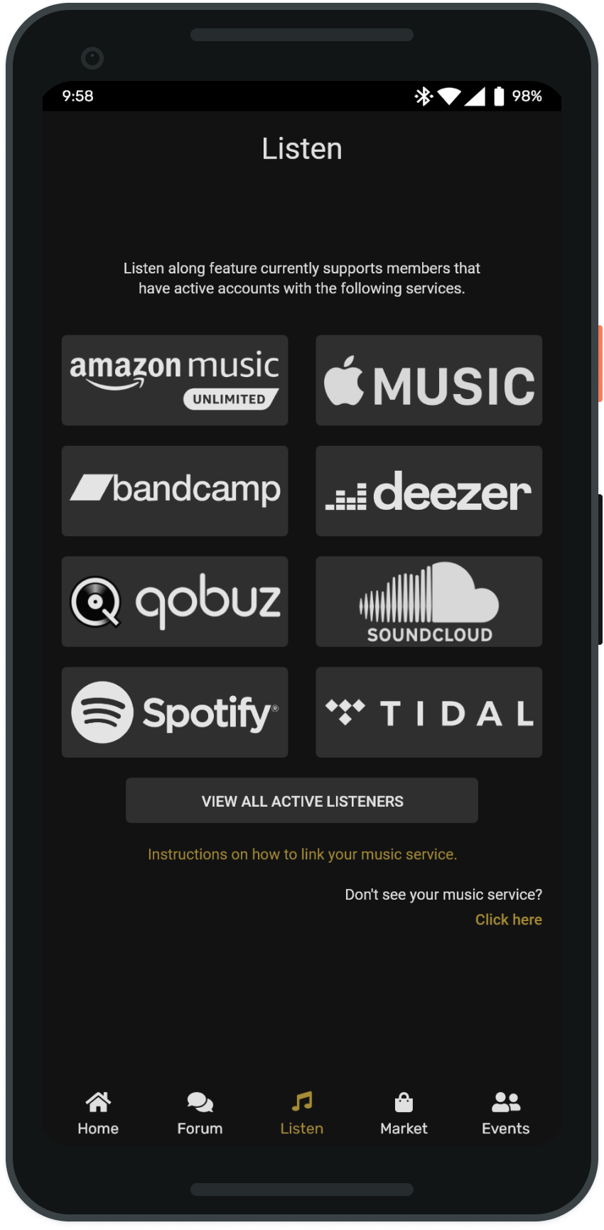
Stylus combines the pieces of the existing forums into one application and adds the feature they all lack: a focus on music and discovering it. Listen-along connects to the services members already pay for, so people can hear what other members are playing and talk about it in the moment. It works with Amazon Music, Apple Music, Bandcamp, Deezer, Qobuz, SoundCloud, Spotify, and Tidal.
Design direction: the app has to work on phones and computers for this demographic, and it has to look the part to attract members. The spec called for a minimal interface, taking a cue from Tidal, in both a dark and a light theme.
Listen along
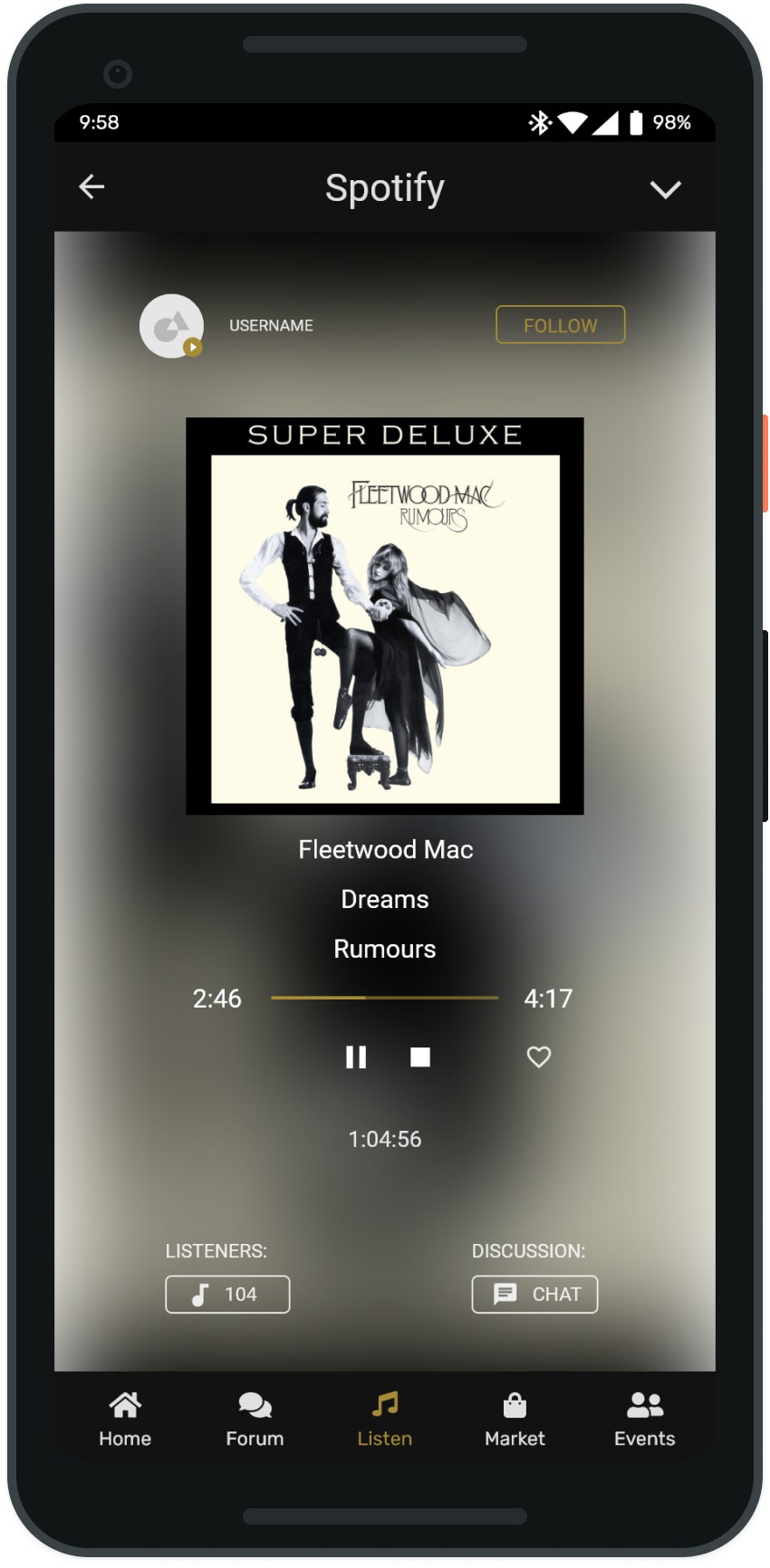
Hear what other members are playing through their own music service, then jump into the discussion.
One place for everything
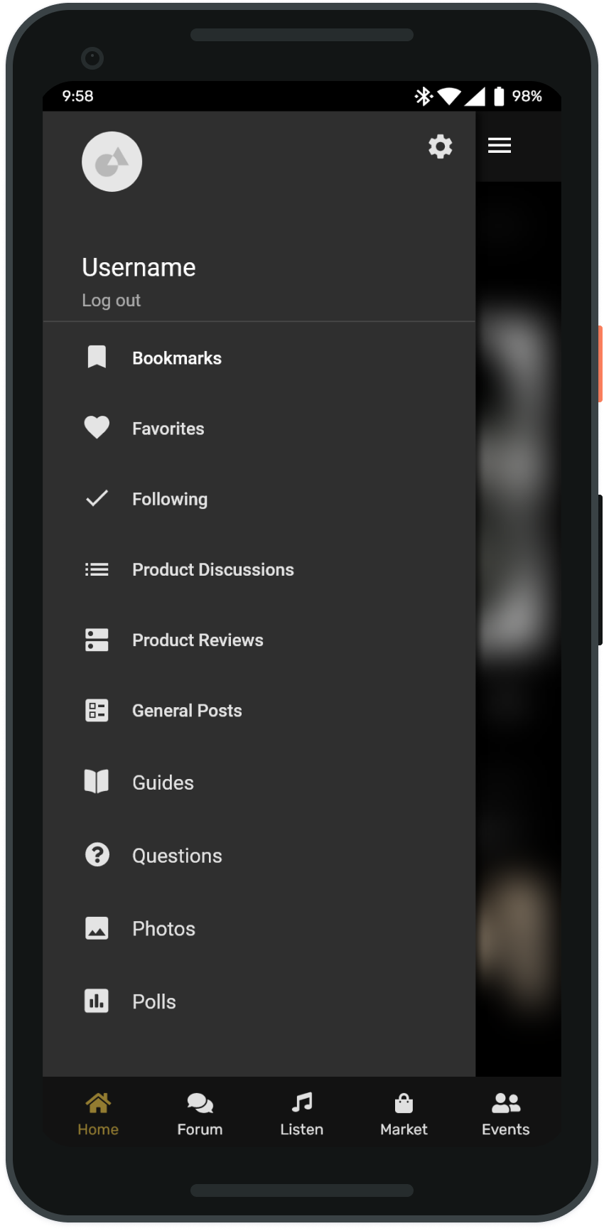
Forums, product reviews, a marketplace, and local meetups, under a single account.
Any device
Phones and desktop, so members reach the community however they prefer. This audience skews older, and plenty of them would rather sit at a computer than read on a phone.
Dark and light
The spec called for both, taking a cue from Tidal's minimal look.
Listen-along flow
The feature the study focused on
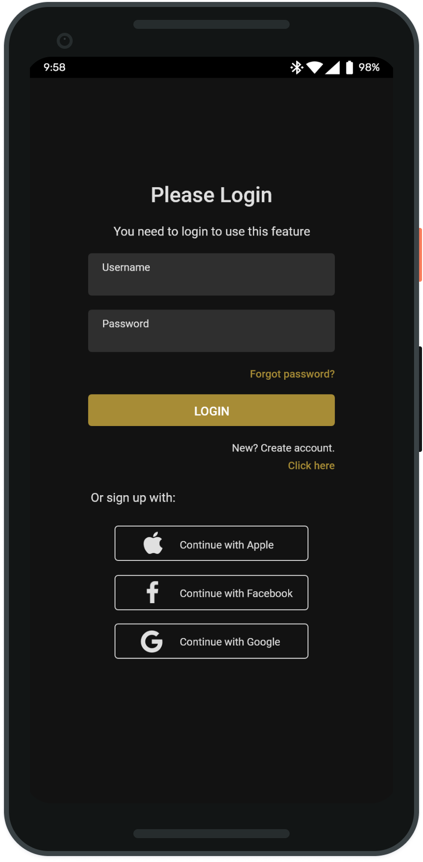
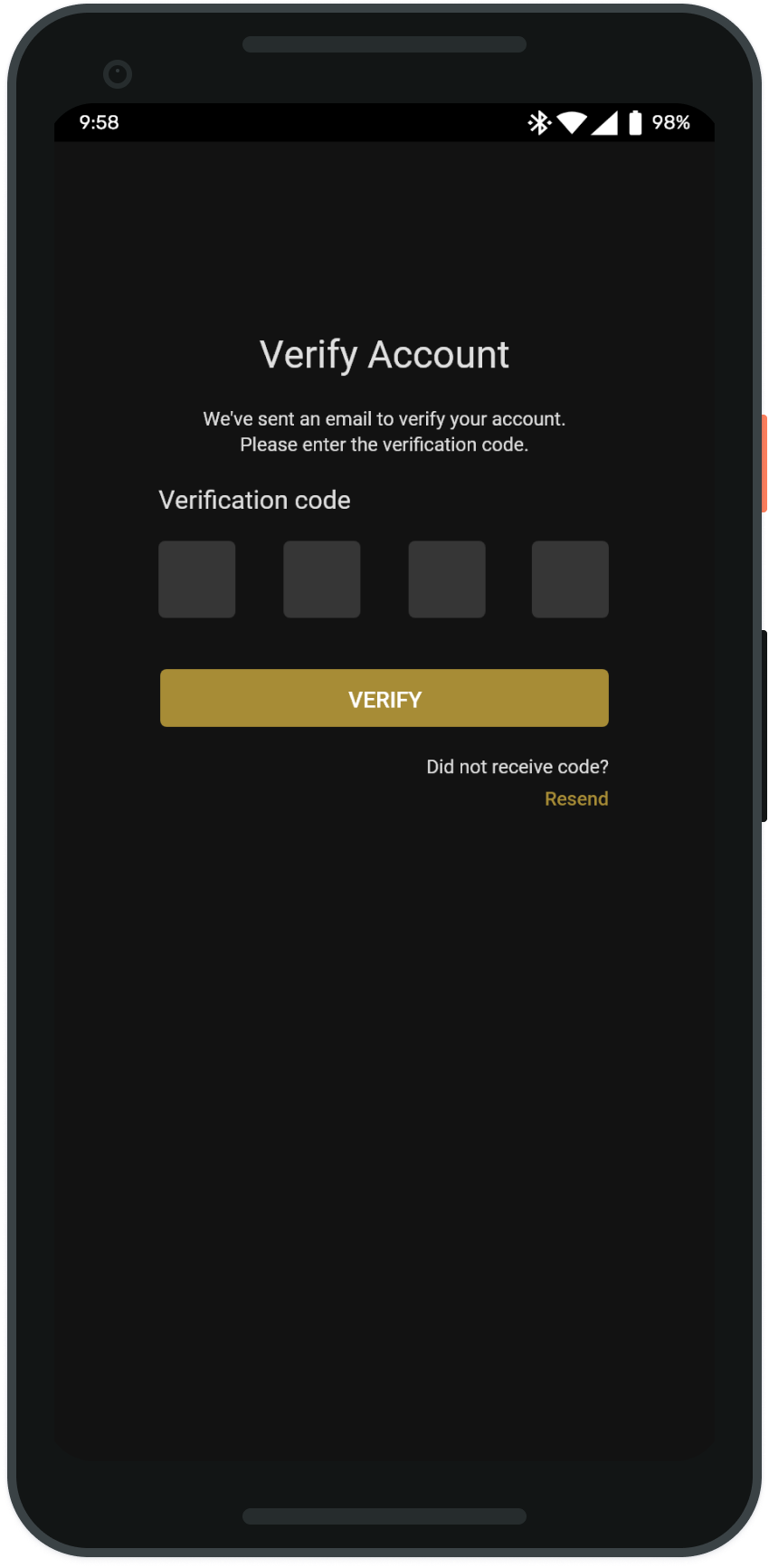
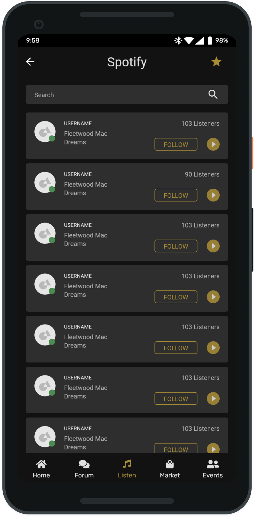
The primary study centered on listen-along, since it's the one thing no existing forum offers. Browsing is open to anyone, but listening along requires an account, so the flow starts at a login gate, moves through account verification, and lands on a list of active listeners showing who's playing what right now.
How it works
Open to view, join to take part
No membership is needed to read, but anything beyond viewing requires an account. From there, each part of the community has its own set of interactions.
Forums
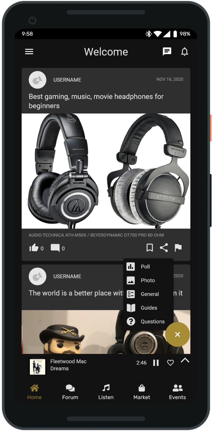
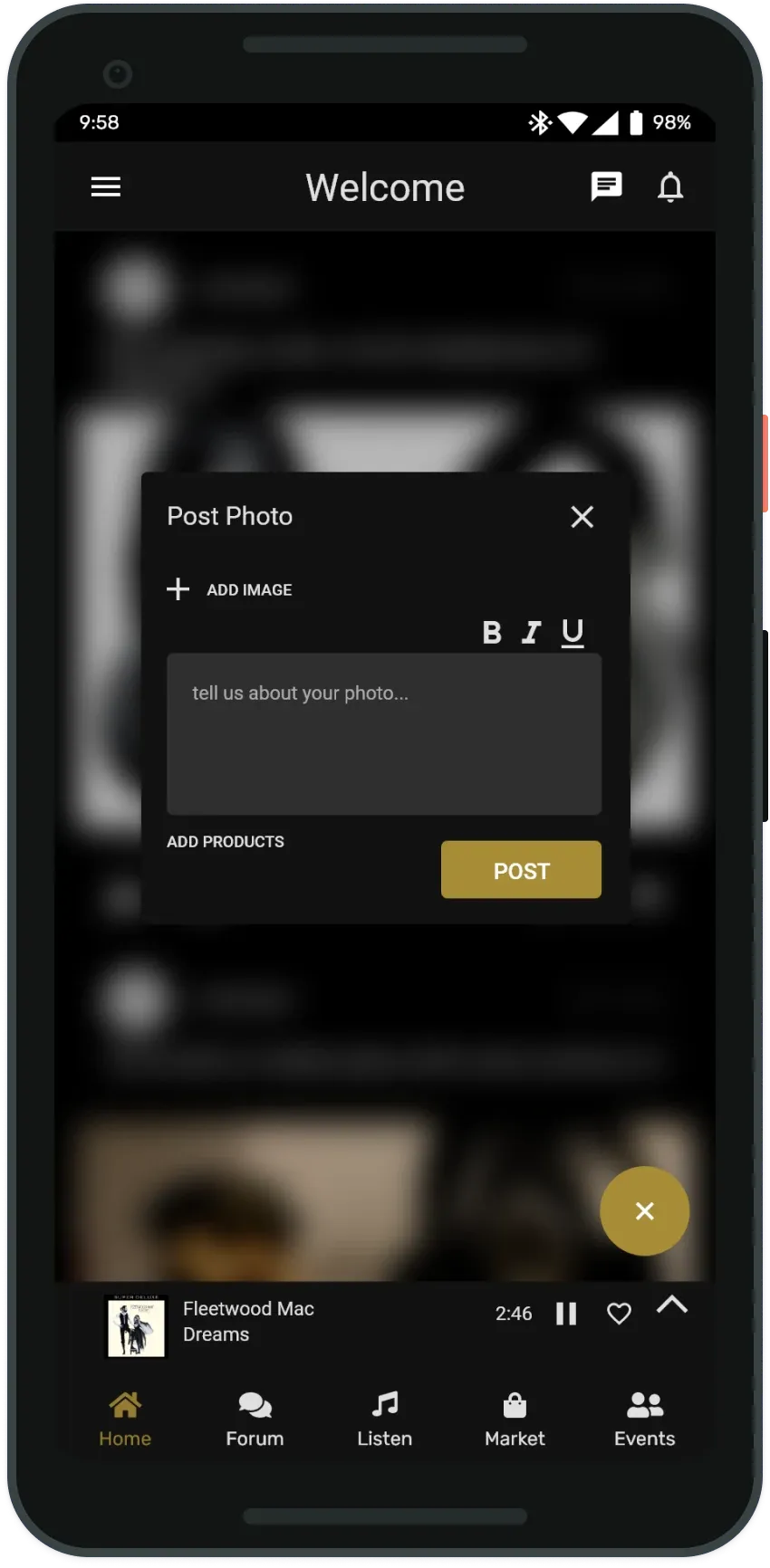
Members post questions, photos, polls, and how-to guides across product discussions, general posts, and more.
Reviews and ratings
Products are rated not just by stars, but by how they sound and how they compare to their price.
Discover and bookmark
Songs heard while listening along can be bookmarked into a list to come back to later.
Marketplace
Members buy and sell directly with each other: albums on CD and vinyl, plus gear and equipment.
Meetups
Organize local events and search within a radius to find other members nearby.
One account
Every feature lives behind a single membership, which is what pulls the divided community back together.
Limitations
What I didn't get to
A semester is a fixed amount of time, and the prototype covers less than the spec asked for. Two pieces of scope never got designed, and the walkthrough at the end of the course turned up four more places where what I did build falls short. Both are worth stating plainly.
A light theme
The spec called for light and dark from the start, the same way I've built every project since. Only the dark theme got designed before the semester ended.
The desktop app
A desktop client was part of the idea, since a good share of this audience would rather be at a computer. Only the mobile app was designed.
Switching music services
Changing to a different streaming platform means navigating back through several screens. Most people use one service, so it may not bite often, but the path is wrong.
The minimize chevron
The control that collapses the player is a small chevron, and I expected first-time users to miss what it does.
The meet page
Create an event or search for members nearby, and not much else. The thinnest screen in the app.
Notifications
Nothing tells you when someone replies to your post or messages you. It was the next thing on the list.
Outcome
A clickable prototype of the whole community
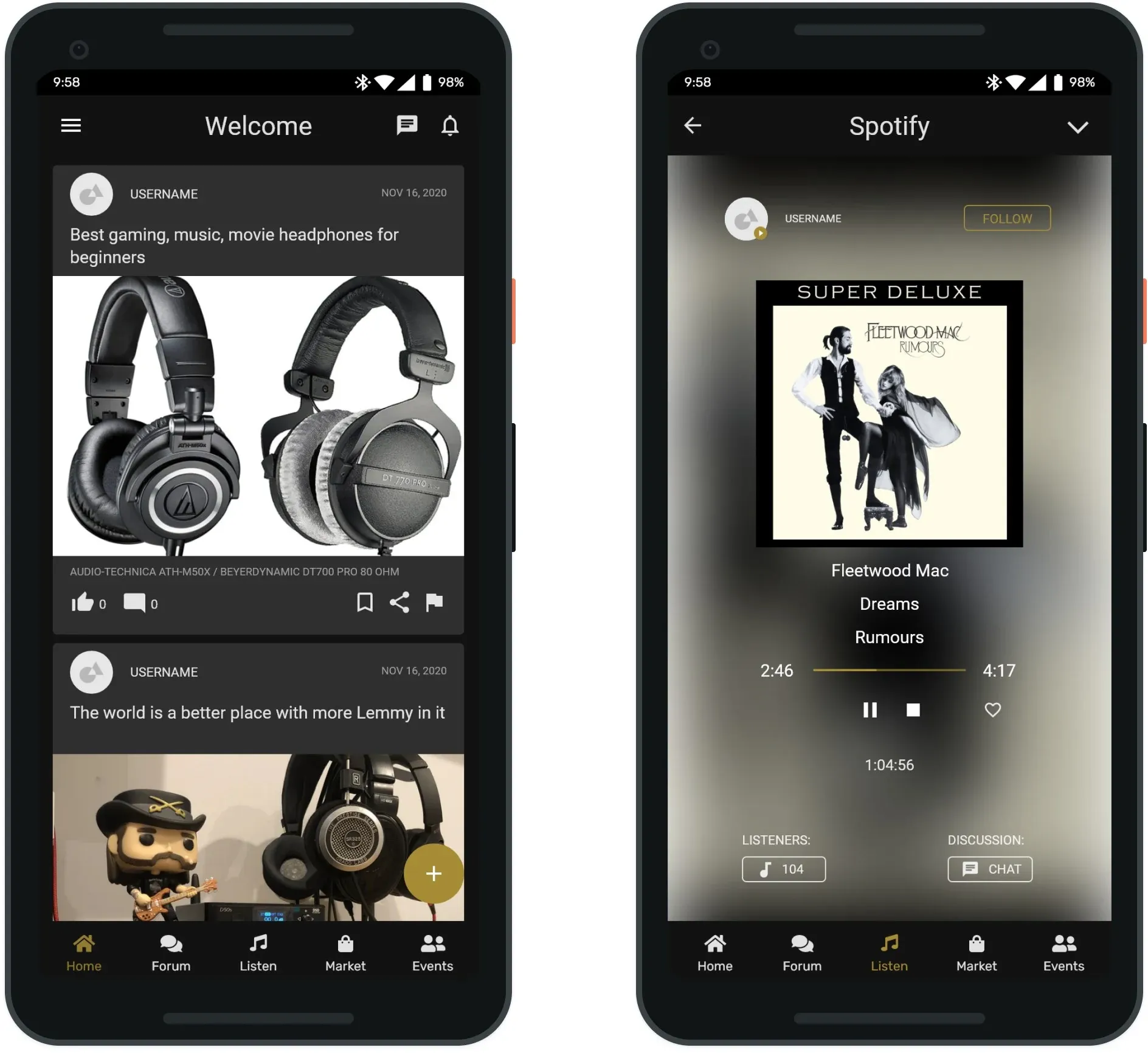
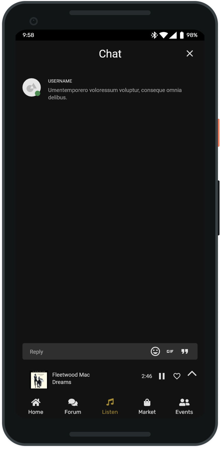
The semester ended with a hi-fi, clickable Adobe XD prototype covering onboarding, the home feed and post composer, the listen-along player and group chat, and the side menu that ties the forum types together.
View the clickable prototype