UX Strategy
Plex
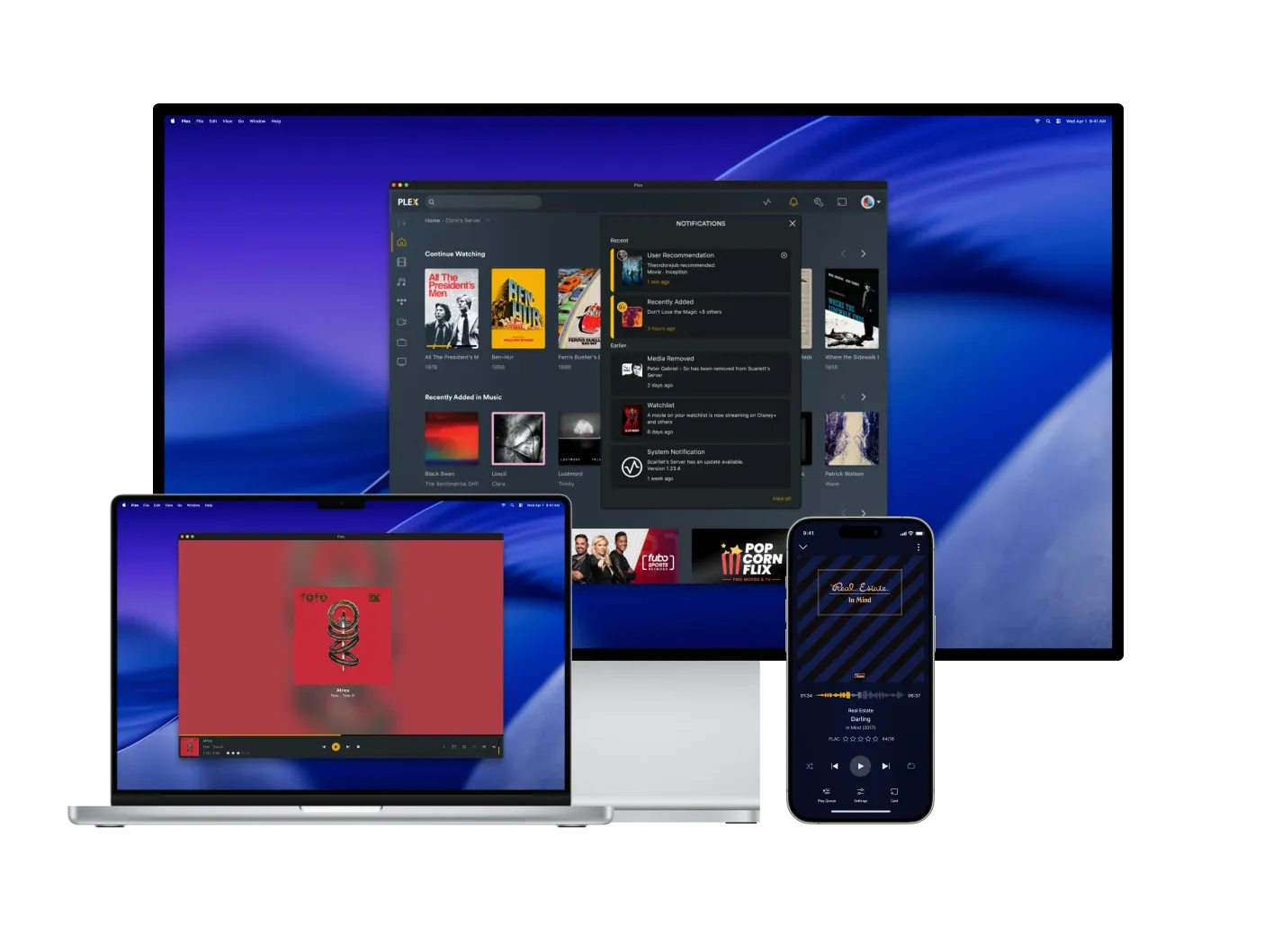
Plex is a free streaming entertainment service that scales from phones to desktops and televisions. I joined as an intern and stayed on part-time, designing, running research, and hunting usability issues and bugs across the product.
In-app messaging
A reusable messaging component for the notification center
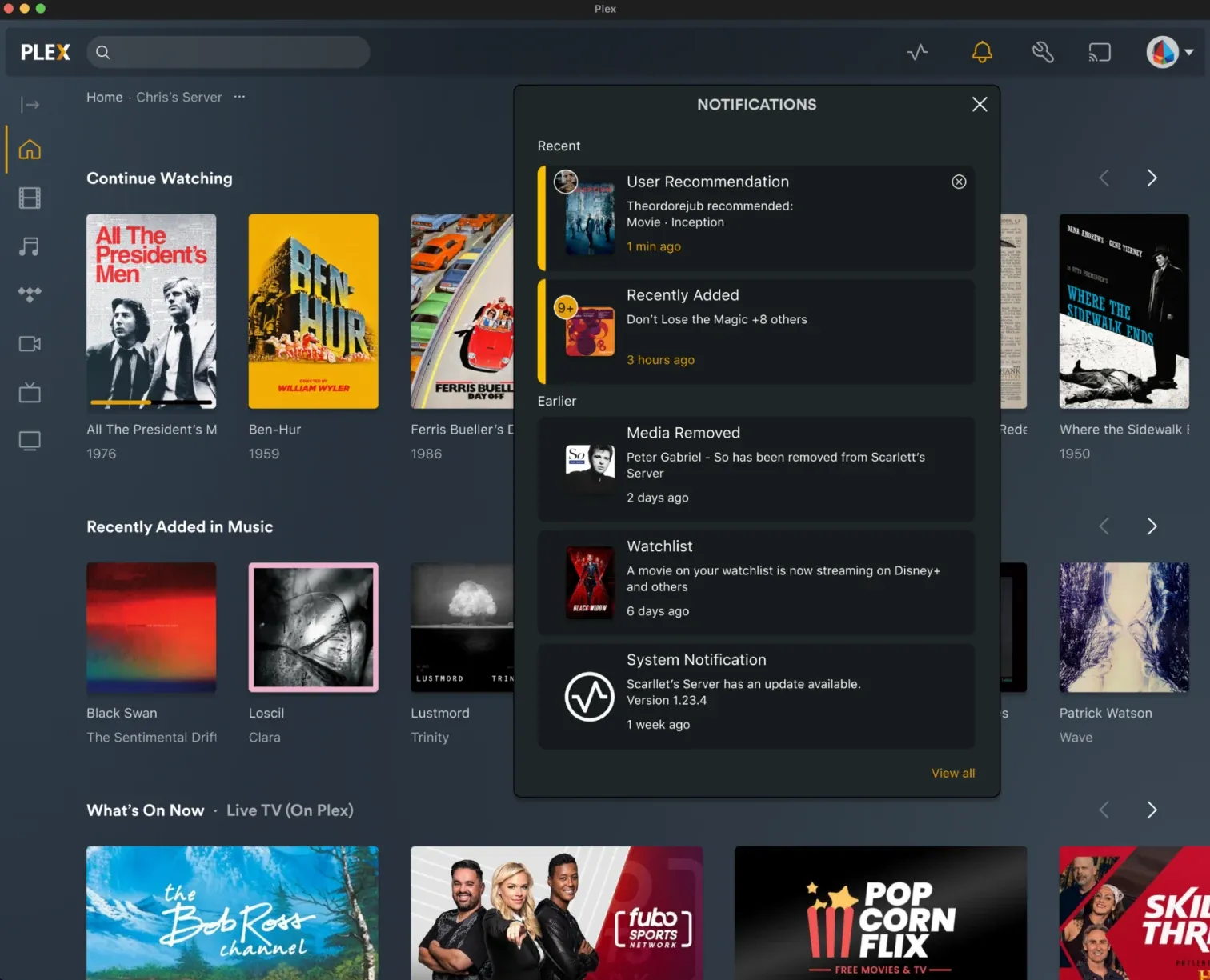
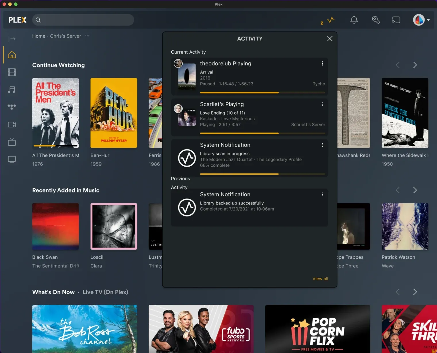
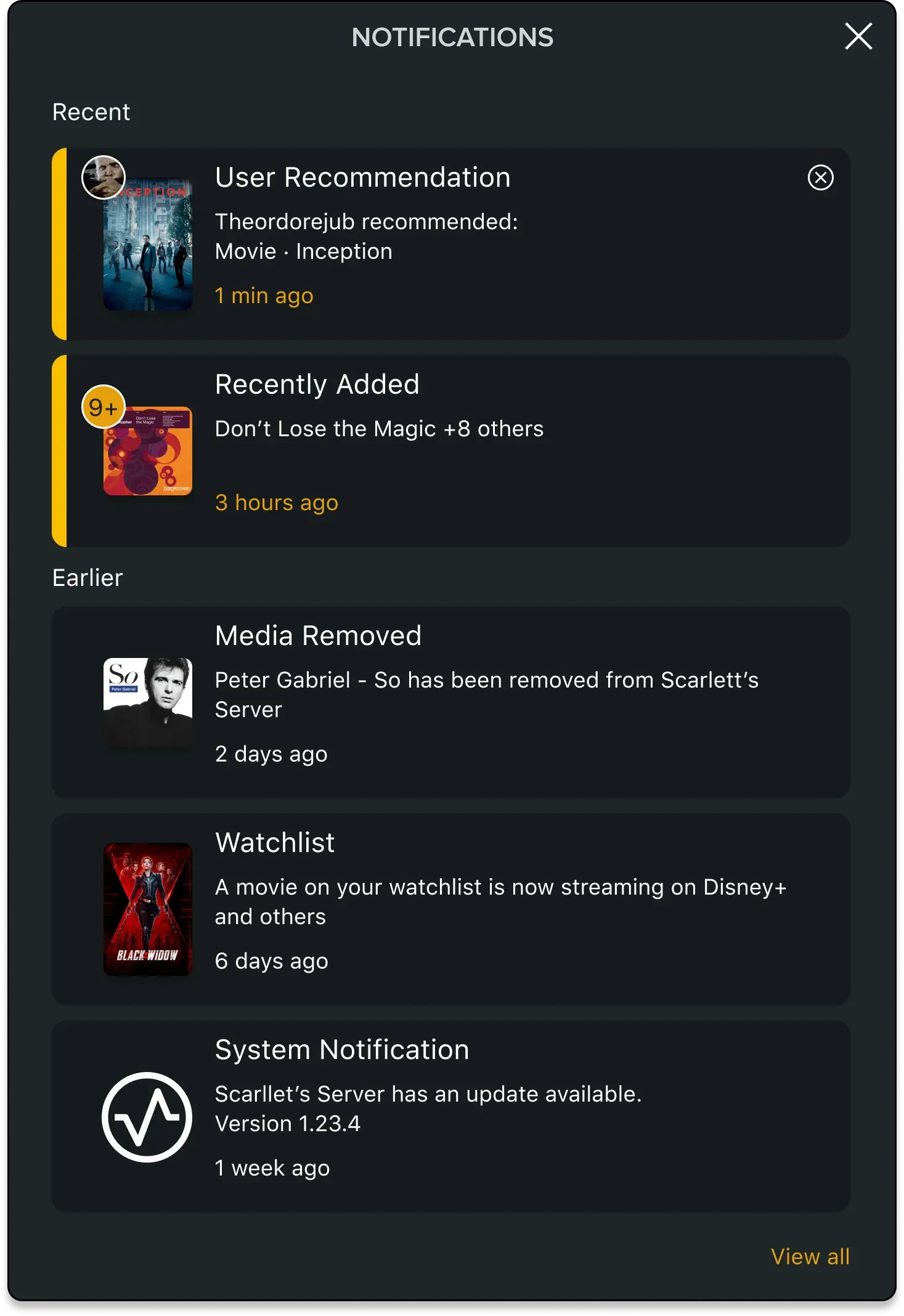
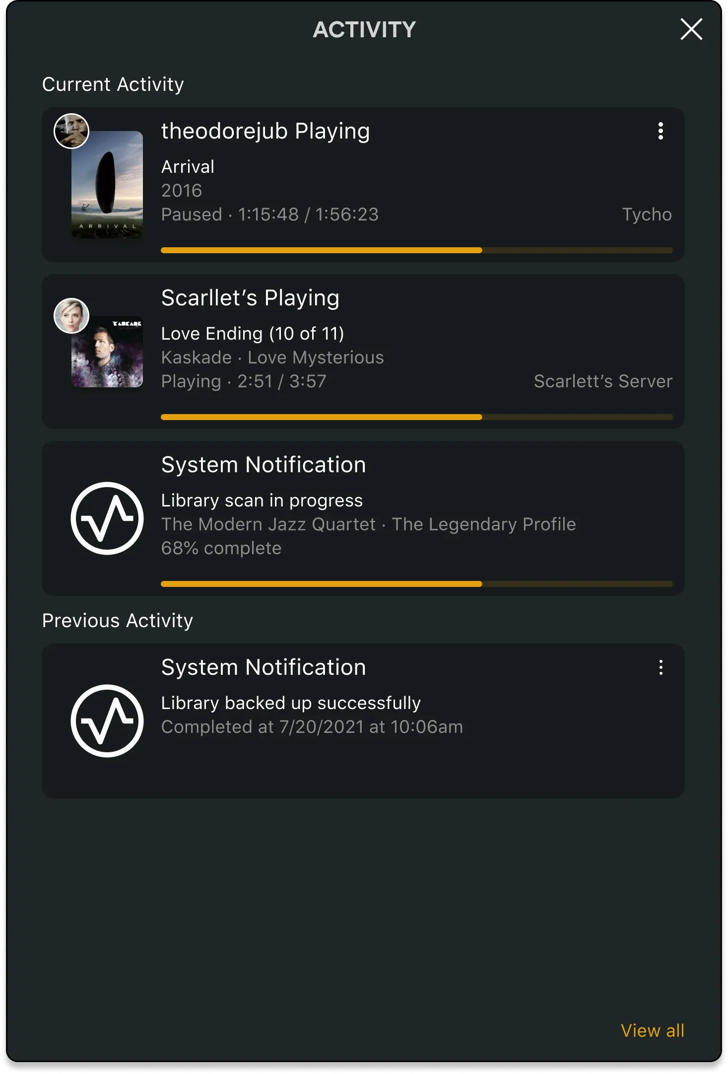
As part of Plex's new design system, my responsibility was to create a messaging design that applies consistently across five message categories: New Content, Live Content, Recommended Content, Features, and Onboarding. Each category covers several different messaging types, so the layout is universal whether it's a recommendation from another user or a server update. The design also had to make each category instantly identifiable, visualize content shared by another user, and indicate bulk uploads with a count in a single message.
The wireframes fixed a consistent anatomy: header, two lines of content, timestamp, icon placement, and read/unread status. From there, I populated it with real data to surface layout issues, iterating through several feedback cycles.
Static width, not height
Portrait and square posters rendered at different sizes and pushed text right. Fixing the artwork width solved alignment across all poster ratios.
Avatar-only attribution
Placing the avatar on the artwork tested best for visibility. Making the avatar the primary identifier, with the username in the message body, incentivizes users to personalize theirs.
Modal updates
Migrating legacy modals to the new design system
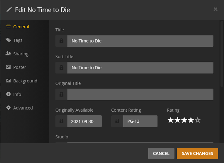
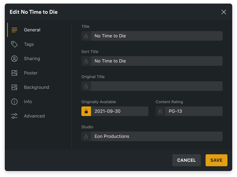
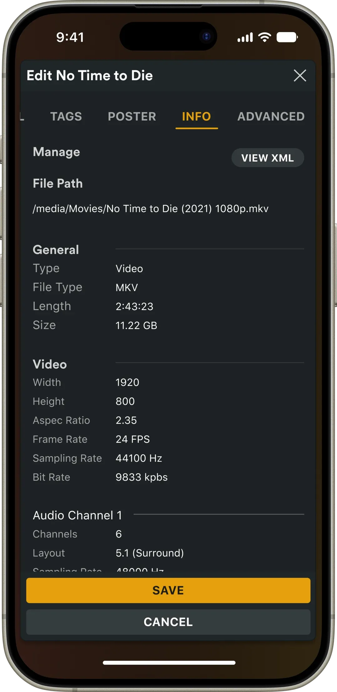
The out-of-date edit modals lacked responsive layouts and current design system components. My responsibility was to convert them while reusing as many existing components as possible. Several pieces weren't specified and needed to be thought out: a navigation component inside a modal, a lock button within input fields, and responsive behavior for smaller displays.
General
Reused the app's existing navigation as the modal's section nav, updated the input-field lock to a button that changes state, and removed the rating, which already lives on the detail page and didn't belong in an edit modal.
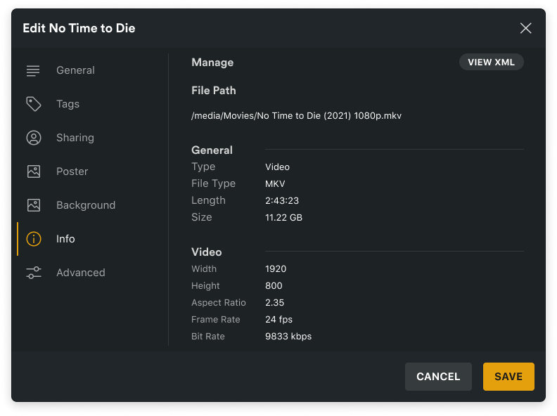
Info
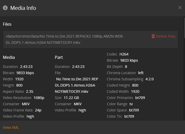
The Info section lacked information architecture, reading as three dense columns where key file properties were hard to find. The update reduces the amount of information, groups it into clear sections with a new General group, and runs one column, so video type, file size, and resolution surface at a glance.
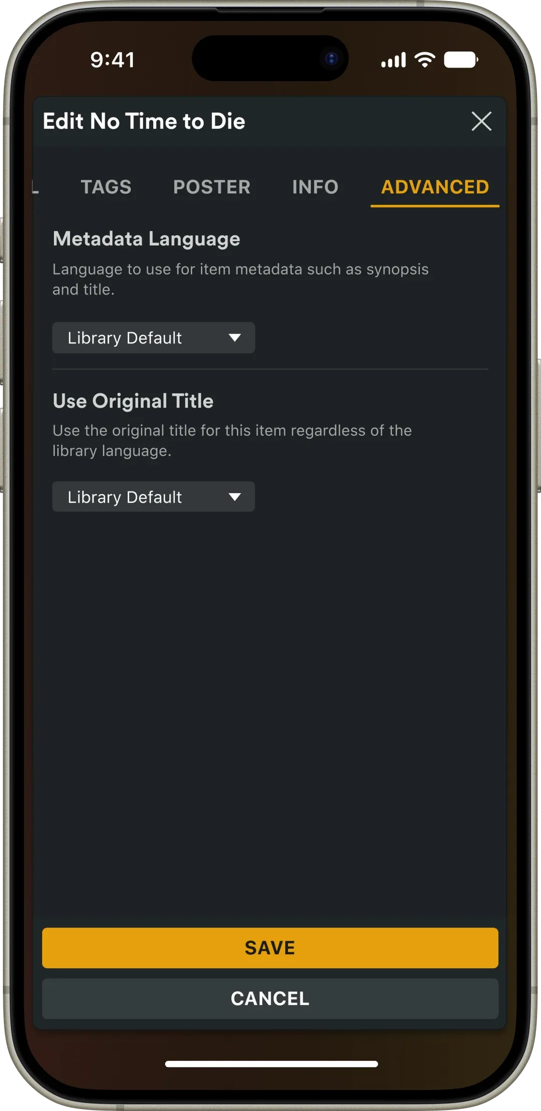
Advanced
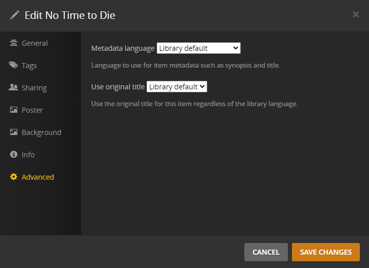
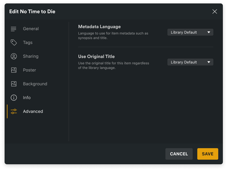
Settings previously read like a sentence flowing into a dropdown. The update gives each setting the conventional header–description–control anatomy, equal-width dropdowns, and dividers between settings. That structure also lets dropdowns collapse under their descriptions on small screens.
New mobile layouts
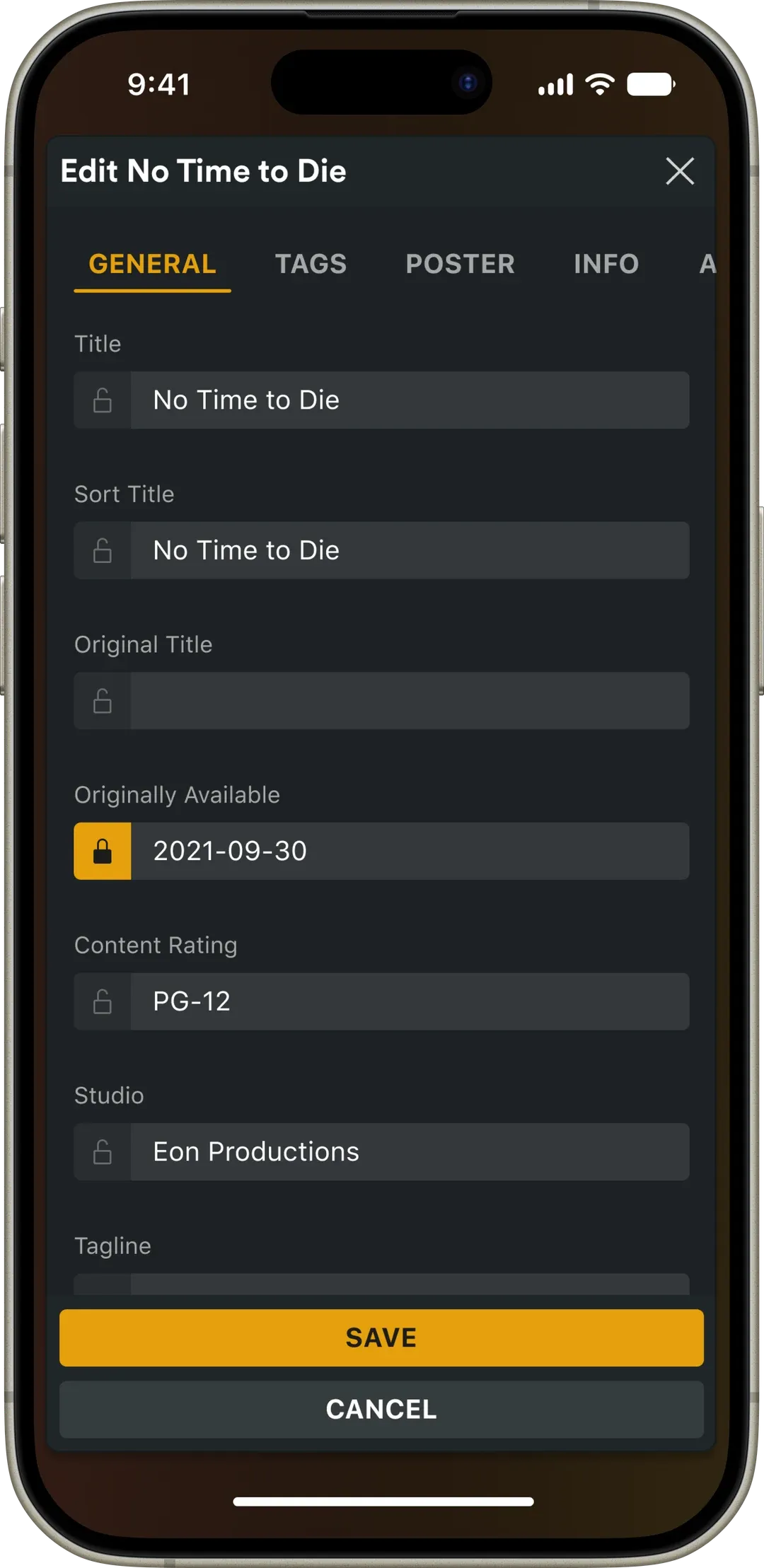
The legacy modals had no mobile layouts at all. On small displays the section nav becomes a tabbed carousel, save and cancel stack full-width, input fields grow in height, and Advanced dropdowns collapse under their descriptions.
Playlist usability test
Which add-to-playlist flow do users actually prefer?
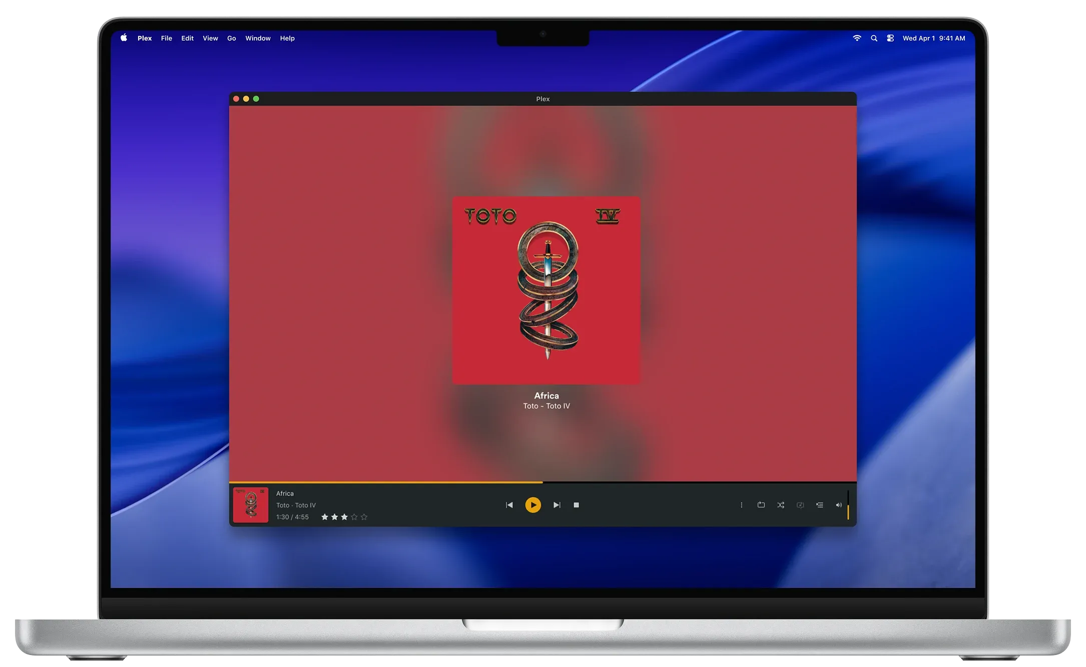
I found an area for an easy win and picked it up. Adding a track to a playlist on desktop surfaced only your five most recent playlists, with everything else buried behind a separate modal. The team agreed it was worth a usability test, so I drafted two options: a scrollable menu containing every playlist, and a 10-recent list with a View All modal. Then I ran an unmoderated test on UserTesting.com with two Figma prototypes, asking users to add a Toto track to their Pop playlist in both.
Participants overwhelmingly preferred Option 1, the overflow menu, calling it "easy to use, pretty self-explanatory" and "way easier than anticipated." No one had trouble scrolling to find more of their playlists.
Tooltips did the work
Most participants read every icon's tooltip before landing on More Actions. Without them, participants couldn't find Add to Playlist under the three-dot menu at all, and one failed the task entirely until the tooltips were added.
Confirmation feedback matters
Users appreciated the modal warning about duplicate tracks, which is worth extending to confirm every successful add, not just the edge case.
Plexamp audit
Aligning Plexamp with the rest of Plex
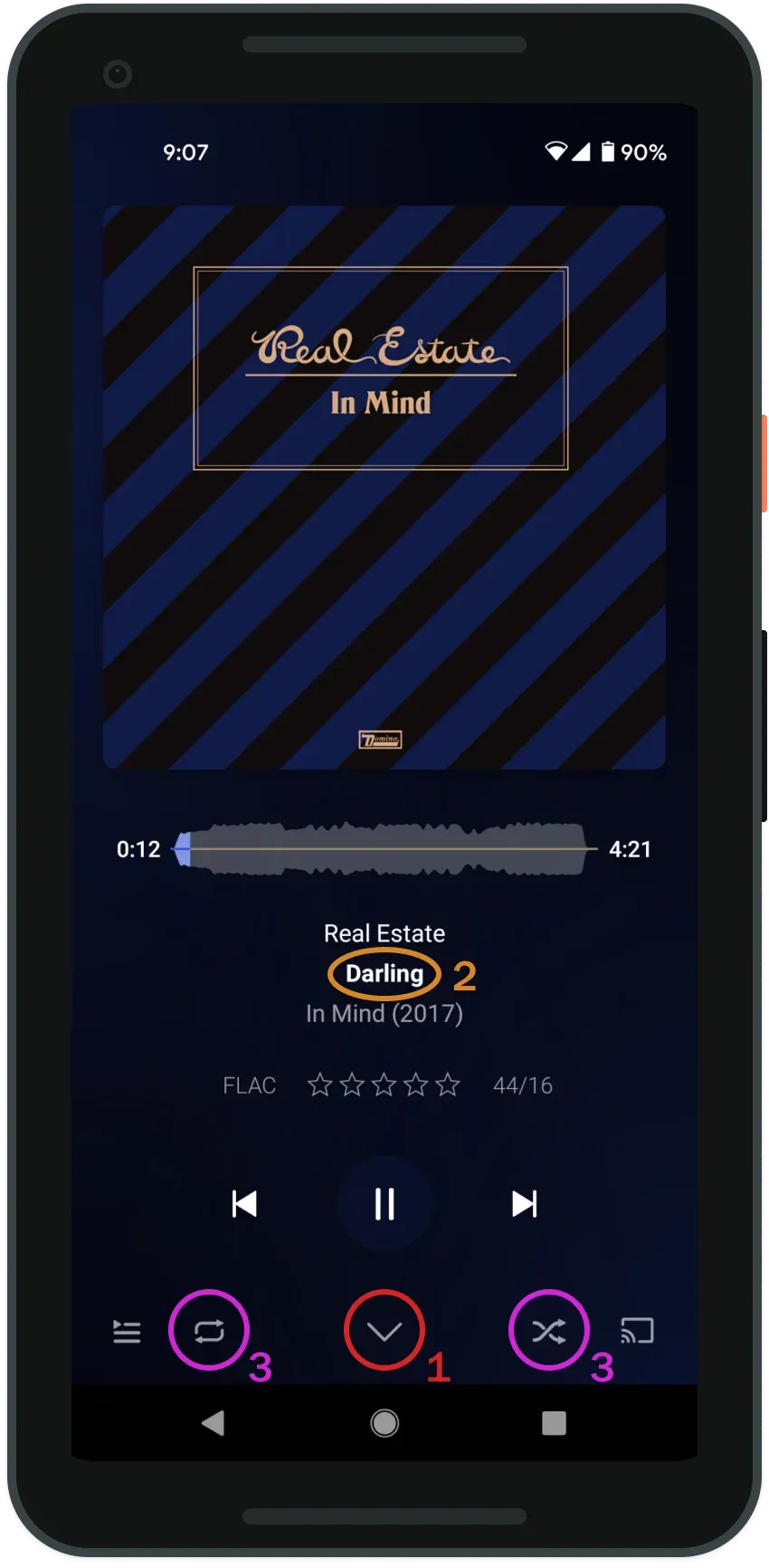
Plexamp is Plex's dedicated music app for PlexPass subscribers. I audited the player screen as another easy win, and set myself one constraint: change as little as possible. Repositioning a few icons takes almost no effort to build, which is what made it worth proposing. Alongside the three numbered changes below, the bottom bar picked up text labels. Play Queue, Settings, and Cast were previously bare icons, so the labels tell users what each control does without tapping to find out.
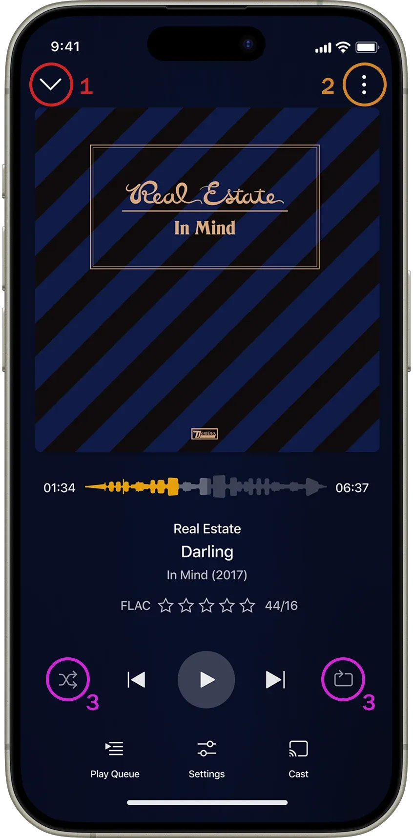
Minimize → top left
Users look to the top of the screen for it; at the bottom, the down-arrow read as "view play queue." It also matches where minimize sits in the Plex desktop app.
Overflow menu → top right
Removes the hidden tap-the-title gesture for adding a track to a playlist.
Shuffle + repeat → with playback
Groups all track-playback controls together for faster recognition.
Outcome
From internship to embedded contract
What began as an internship in May 2021 converted into a part-time contract that ran alongside the final year of my master's, through to July 2022. Some of the work came to me and some I assigned myself by looking for quick usability wins worth making a case for, which is where the Plexamp audit and the add-to-playlist test started. Throughout, I was hands-on with the product, finding usability issues and bugs and reporting them to the team.